
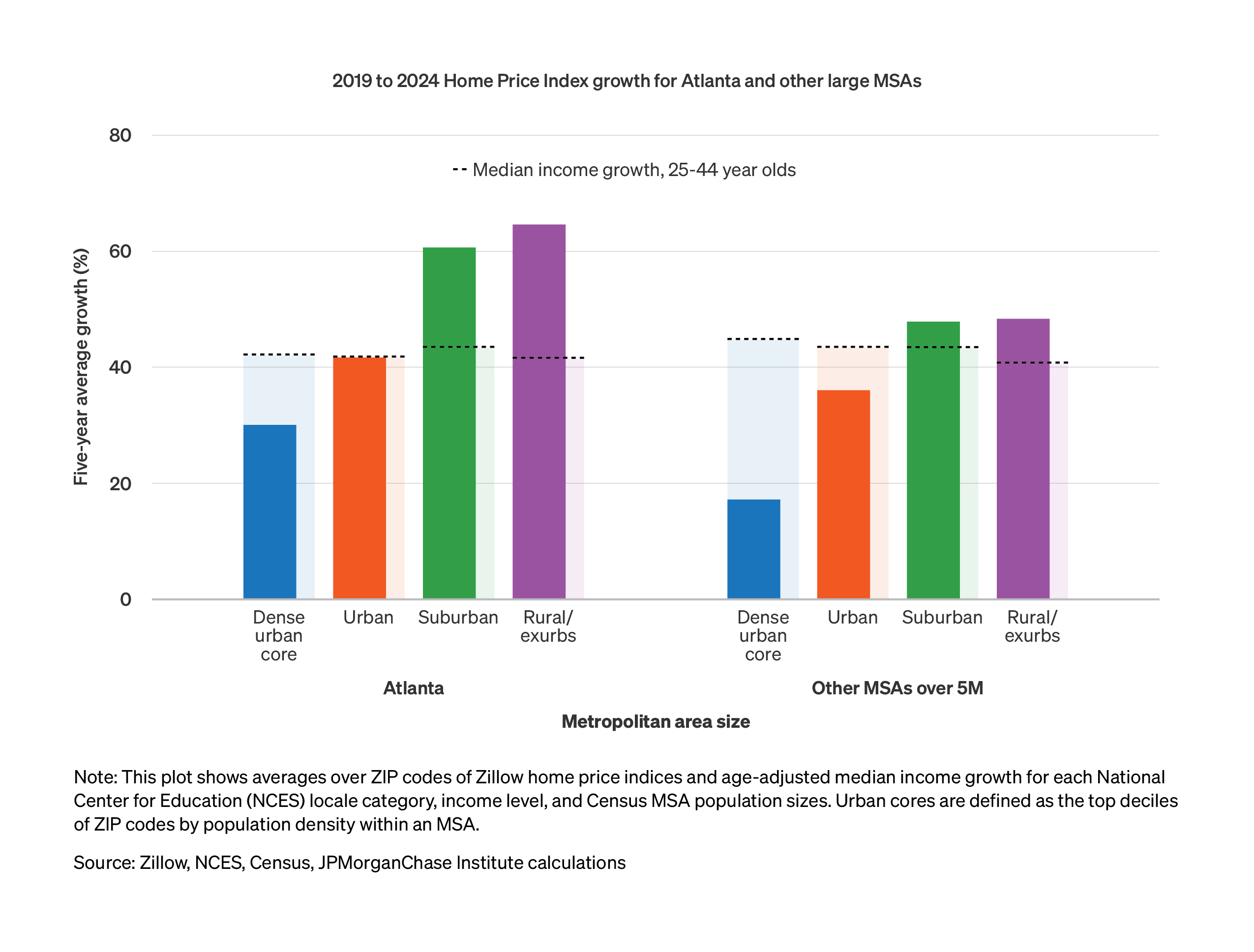
Figure 1: Housing affordability changes across urban-rural and income spectrums show affordability worsening most in the suburbs and exurbs of Atlanta.
Latest news

An Ohio-based company is protecting first responders around the world
With support from JPMorganChase, Fire-Dex is providing protective equipment to firefighters in 100 countries and all 50 states.
Learn moreLatest news

Veteran’s Unconventional Path to Landing her Dream Job in Tech
U.S. Army Veteran Ashley Wigfall transitioned to a civilian role and charted her path to technologist through mentorship and skills training at the JPMorgan Chase tech hub in Plano, Texas.
Learn more
Research
November 19, 2025
Access to affordable housing is a cornerstone of thriving communities—yet in Atlanta, like most cities in the U.S., rising costs and limited supply have made homeownership increasingly out of reach for many families. Homeownership costs rose over 60 percent relative to incomes, as the monthly mortgage expense for would-be homebuyers increased from 25 percent of median income in 2019 to 41 percent in 2025.1
This report uses granular data to dive deeper into changing housing affordability across the Atlanta metro area.2 The analysis compares rising housing costs with median worker income gains over 2014–24 to highlight financial challenges facing would-be first-time homebuyers. Notably, lower-income areas and the suburbs have experienced the highest increases in home prices relative to incomes for those 25–44-years-old, the age group covering most first-time homebuyers.
Atlanta, like many other large metro areas across the country, experienced significantly larger home price increases in their suburbs and exurbs than in their urban centers, a lasting consequence of pandemic-era shifts in housing demand amid supply constraints.3 Figure 1 shows home price increases relative to median income growth among the 25-44-year-old population over 2019–24 across urban-rural groups, comparing Atlanta with other large cities.4 A map in the Appendix depicts the Urban-Rural breakdown of the Atlanta metro area. The decline in affordability in its suburbs and exurbs were larger than other cities with metro populations over 5 million. In Atlanta’s dense urban center, median incomes for younger workers rose by more than home prices, but affordability still worsened when considering the role of higher mortgage rates—which applies across areas.5
Figure 1: Housing affordability changes across urban-rural and income spectrums show affordability worsening most in the suburbs and exurbs of Atlanta.
Figure 2 provides a geographic view into this trend, showing changes home prices relative to the median income change of residents at a ZIP-code-level across the Atlanta metro area. Over 2014–19, changes in affordably were mixed geographically—with neighborhoods just south of the downtown center experiencing a decline in affordability relative to those just north of the center, while most other areas were somewhere in between. The pattern over 2019–24 resembles a pronounced “donut effect,” described in academic research (Ramani and Bloom, 2024).
Figure 2: Areas far from Atlanta’s city center experienced a deeper decline in affordability over 2019–24, a distinct pattern relative to the prior five-year period.
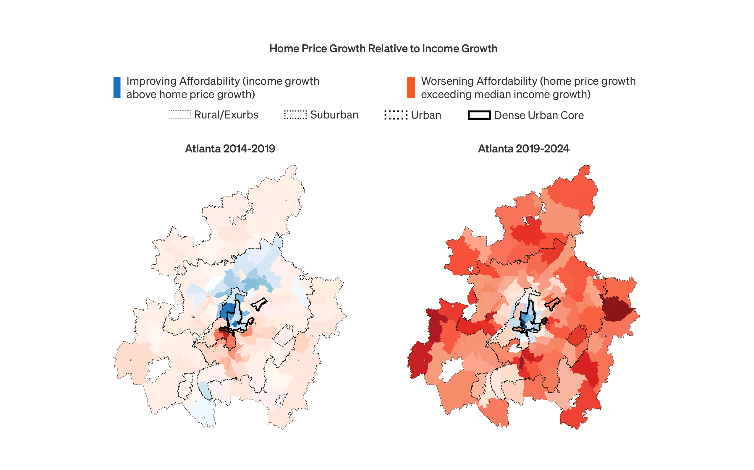
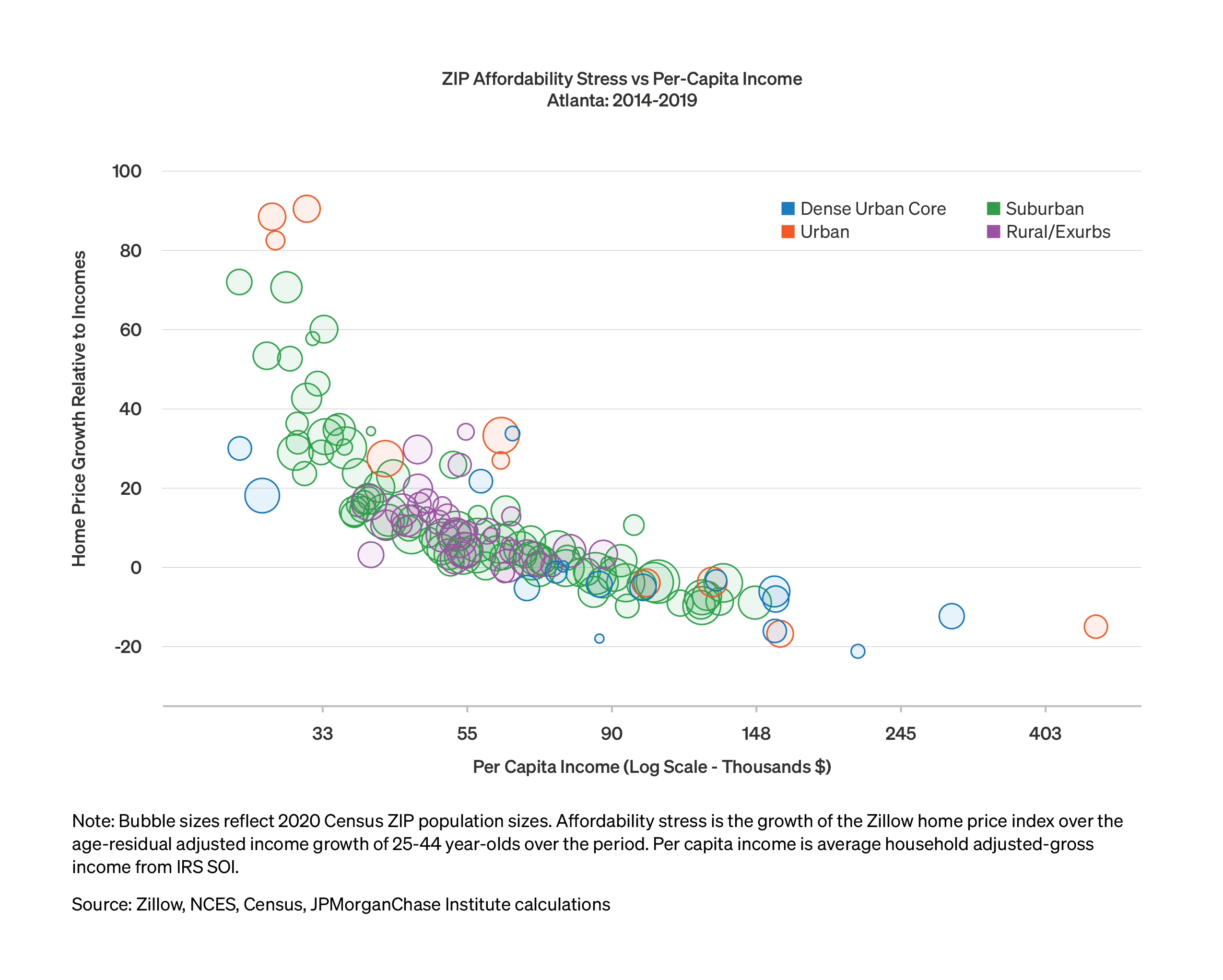
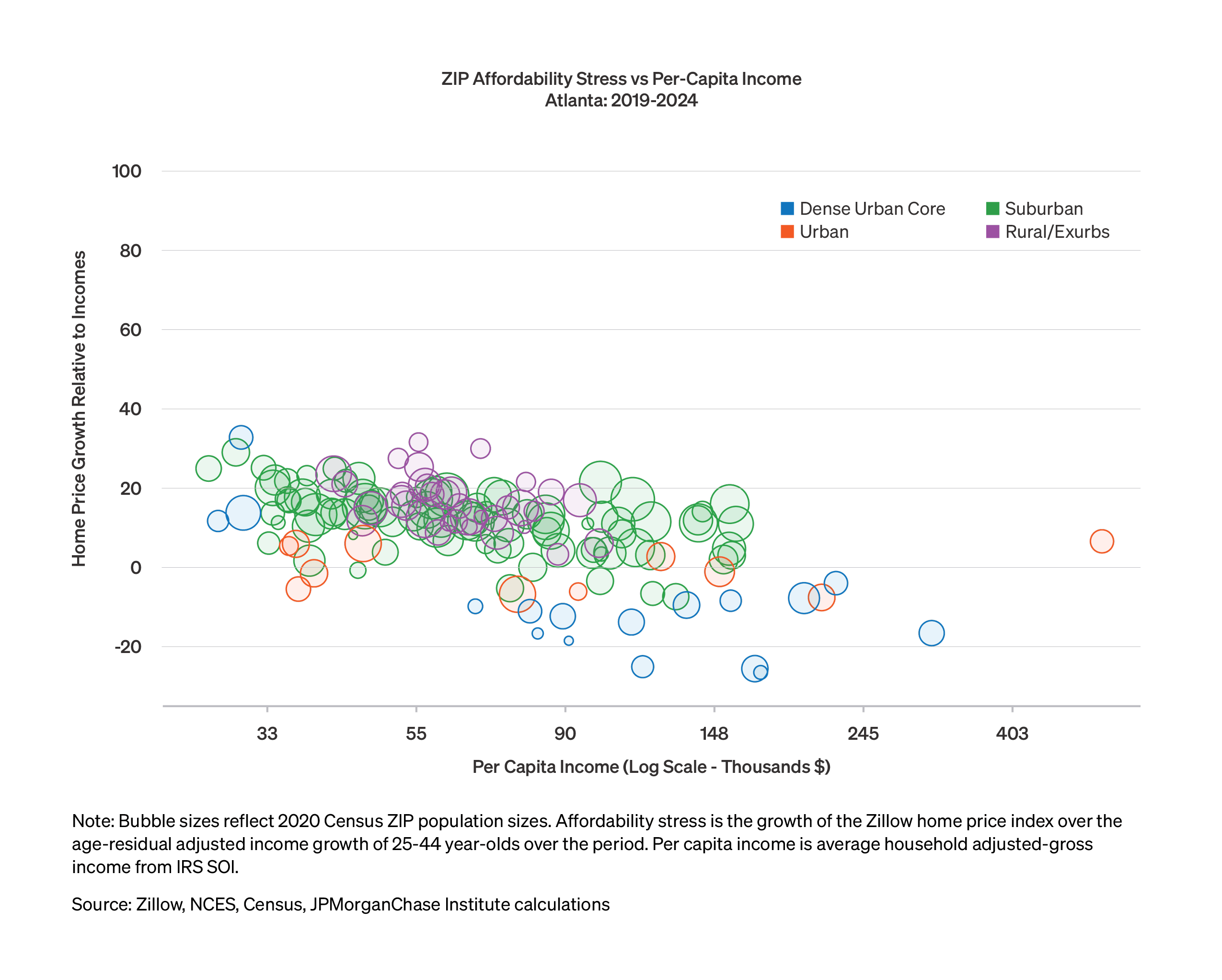
Figure 3 shows the extent to which home prices have outstripped median income growth, broken out by ZIP-code-level average income. Over 2014–19 (shown in the first panel), affordability worsened notably more in lower-income areas. This dynamic hit the lower-income parts of both urban and suburban ZIP codes, with some areas seeing home price increases in excess of income exceeding 50 percent. Since 2019, the differences by income segment have been less pronounced but still modestly extended the 2014–19 trend. Since those with lower incomes have fewer options in the housing market, the cumulative changes over the past ten years represent a challenge that disproportionately affects more financial vulnerable households. In particular, for those seeking to become first-time homebuyers, suburban neighborhoods with low-to-moderate average incomes have become increasingly out of reach.
Figure 3: Decline in affordability in lower-income areas over 2019–24 compounds a pronounced trend disadvantaging those areas prior to the pandemic.
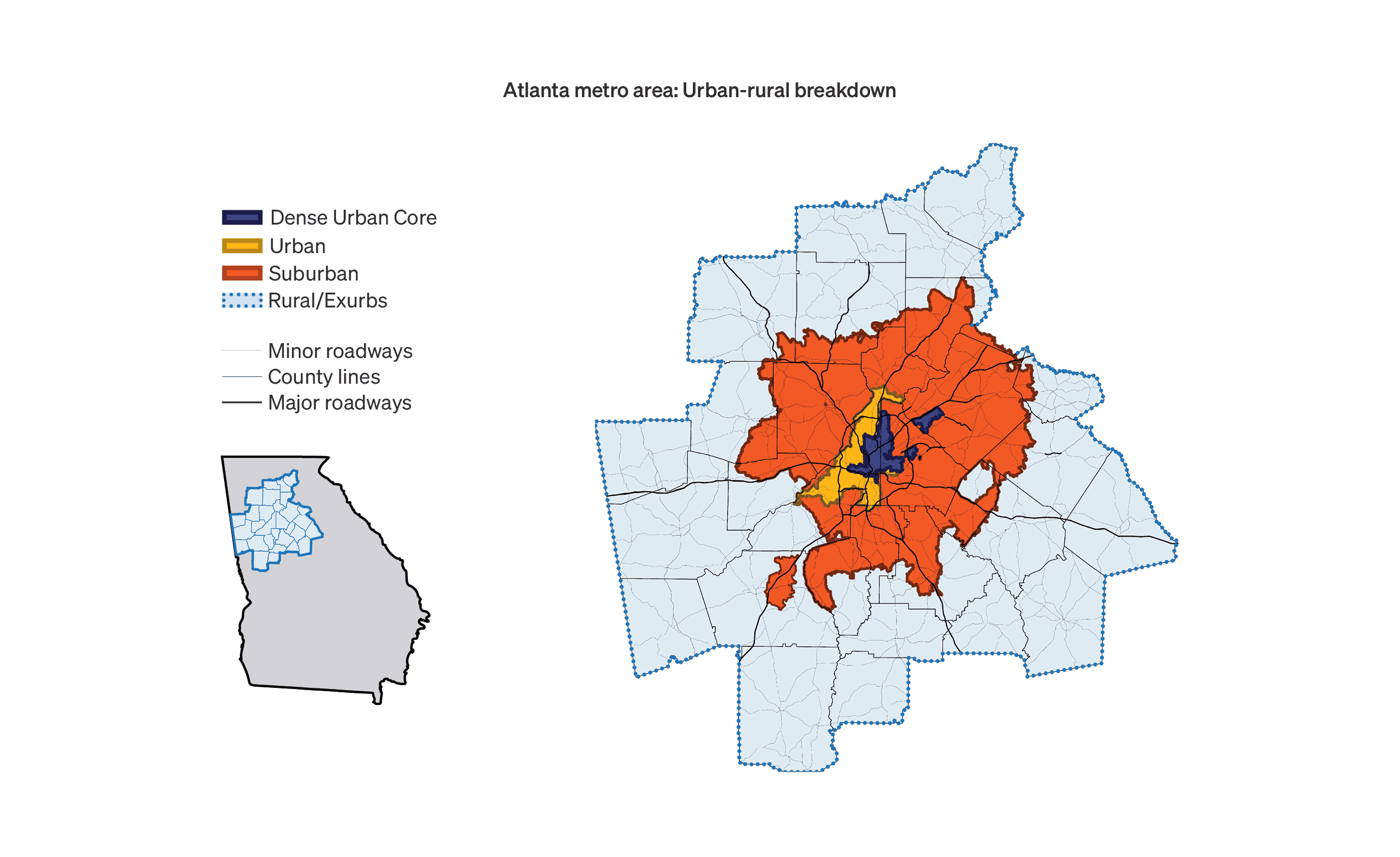
Appendix: Map of the Atlanta Metro Area by Urban-Rural Categories
As households, businesses, and policymakers in Atlanta contend with challenging and dynamic housing affordability conditions, JPMorganChase has released a What Works brief, outlining strategies to address these critical issues.
Glaeser, Edward and Joseph Gyourko. 2025. “America’s Housing Affordability Crisis and the Decline of Housing Supply.” Brookings Papers on Economic Activity. https://www.brookings.edu/wp-content/uploads/2025/03/6_Glaeser-Gyourko.pdf
Ramani, Arjun and Nicholas Bloom. 2022. “The Donut Effect of COVID-19 on Cities,” NBER Working Paper Series.
Wheat, Chris, and George Eckerd. 2025. “The Affordability Gap: Is home ownership still within reach in today’s economy?” JPMorganChase Institute. https://www.jpmorganchase.com/institute/all-topics/community-development/the-affordability-gap-is-home-ownership-still-within-reach-in-todays-economy.
We thank our research team, especially Guillaume Kasten-Sportes, for his contributions to the analysis. We are indebted to our internal partners and colleagues, who support delivery of our agenda in a myriad of ways and acknowledge their contributions to each and all releases.
This material is a product of JPMorganChase Institute and is provided to you solely for general information purposes. Unless otherwise specifically stated, any views or opinions expressed herein are solely those of the authors listed and may differ from the views and opinions expressed by J.P. Morgan Securities LLC (JPMS) Research Department or other departments or divisions of JPMorgan Chase & Co. or its affiliates. This material is not a product of the Research Department of JPMS. Information has been obtained from sources believed to be reliable, but JPMorgan Chase & Co. or its affiliates and/or subsidiaries (collectively J.P. Morgan) do not warrant its completeness or accuracy. Opinions and estimates constitute our judgment as of the date of this material and are subject to change without notice. No representation or warranty should be made with regard to any computations, graphs, tables, diagrams or commentary in this material, which is provided for illustration/reference purposes only. The data relied on for this report are based on past transactions and may not be indicative of future results. J.P. Morgan assumes no duty to update any information in this material in the event that such information changes. The opinion herein should not be construed as an individual recommendation for any particular client and is not intended as advice or recommendations of particular securities, financial instruments, or strategies for a particular client. This material does not constitute a solicitation or offer in any jurisdiction where such a solicitation is unlawful.
Wheat, Chris, and George Eckerd. 2025. “Housing affordability worsens in Atlanta, especially in lower-income and suburban areas.” JPMorganChase Institute. https://www.jpmorganchase.com/institute/all-topics/community-development/housing-affordability-worsens-in-atlanta-especially-in-lower-income-and-suburban-areas
Footnotes
According to the Atlanta Fed Home Ownership Afforability Monitor.
Prior Institute research using the same methodology has covered the Austin, Chicago, and Columbus metro areas.
Academic research has dubbed the relative fall in housing demand in dense urban cores a “donut” effect: see Ramani, Arjun and Nicholas Bloom, 2022. “The Donut Effect of COVID-19 on Cities,” NBER Working Paper Series. Academic research has called attention to zoning and permitting issues that have held down housing supply, particularly in Sunbelt suburban areas (Gyourko and Glaeser, 2025).
Authors

Chris Wheat
President, JPMorganChase Institute

George Eckerd
Wealth and Markets Research Director, JPMorganChase Institute
Media contact
Shelby Wagenseller,
Shelby.Wagenseller@jpmchase.com