
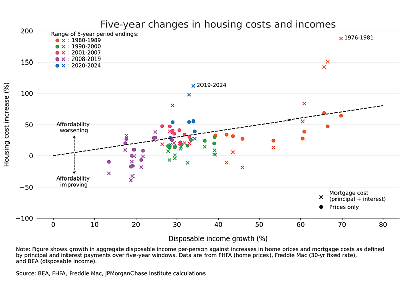
Figure 1: Both prices and interest rate increases have shifted the cost of home ownership upward in 2024, relative to income changes, by the most since the early 1980s.
Latest news

An Ohio-based company is protecting first responders around the world
With support from JPMorganChase, Fire-Dex is providing protective equipment to firefighters in 100 countries and all 50 states.
Learn moreLatest news

Veteran’s Unconventional Path to Landing her Dream Job in Tech
U.S. Army Veteran Ashley Wigfall transitioned to a civilian role and charted her path to technologist through mentorship and skills training at the JPMorgan Chase tech hub in Plano, Texas.
Learn more
Research
The affordability gap: Is home ownership still within reach in today’s economy?
June 17, 2025
Today's first-time buyers face the toughest path to homeownership in decades. Post-pandemic increases in home prices and interest rates led to a rapid deterioration in housing affordability. In 2019, only one-in-five people thought that home prices would rise by 20 percent or more over the subsequent 5 years, according to a New York Fed survey of consumers.1 Over the next 5 years ending December 2024, nationwide home price indices rose about 50 percent, indicating how far the housing market moved relative to expectations.2 Meanwhile, the 30-year fixed mortgage rate rose from 3.7 percent at the end of 2019 to 6.9 percent at the end of 2024. This combination of higher prices and rates caused monthly mortgage costs to double for would-be buyers.
Incomes have not kept up with housing cost increases—even for younger individuals, who historically have higher wage growth on average. Median income growth from December 2019 to December 2024 was 41 percent in nominal terms for the cohort of individuals aged 25−44 in 2019.3 After adjusting for overall consumer price inflation, this performance was below the pre-pandemic trend.4 The average age of first-time homebuyers rose to an all-time high of 38 years old in 2024, according to a survey from the National Association of Realtors, as individuals needed to climb further up their career ladder to afford a home.
The broad decline in housing affordability can be quantified using a variety of public data sources. This analysis seeks to complement recent studies by using granular data showing how budgets—based on changes in take-home pay of millions of individuals—have evolved for the typical individual over time. This lens helps remove a key source of bias affecting public data on housing affordability: since people tend to move to areas in which they can afford a home, local income levels may, in part, reflect home prices themselves. By looking at individual-level income changes, we can better capture how the pandemic and post-pandemic shocks to the housing market led to divergence between incomes and home prices in different types of neighborhoods.
Taking both national and local perspectives, our analysis is organized around the following findings:
Key findings
Historically, nominal incomes and home prices tended to move together, albeit imperfectly, which helped stabilize the portion of household budgets that went toward housing. Since planning for a home purchase may take several years or more, we consider five-year periods in this analysis. Growth of incomes over five-year windows has exceeded that of home prices more than 60 percent of the time since the mid-1970s, depicted in Figure 1 below.5 The secular decline in interest rates from highs the early 1980s through the pandemic provided a further tailwind, suppressing monthly mortgage costs. Inclusive of both home prices and interest rates, income growth has exceeded changes in mortgage costs in over 70 percent of five-year intervals since 1980.6 The last time changes in mortgage costs have exceeded income growth by so much was during the late 1970s and early 1980s—when the Federal Reserve under Chair Paul Volcker hiked interest rates to historic highs to quell high inflation.
Figure 1: Both prices and interest rate increases have shifted the cost of home ownership upward in 2024, relative to income changes, by the most since the early 1980s.
In data covering millions of individuals’ take-home pay, the median increase in income among 25−44-year-olds (typical first-time homebuyer age) was 41 percent from 2019 to 2024.7 While this growth outstrips economy-wide aggregates—because career and skill advancement is faster for younger people—it falls short relative to the doubling in the monthly expense of a mortgage.8 Many people that have been saving for a home over the past several years are finding the reality of what they can afford falling far short of their expectations.9
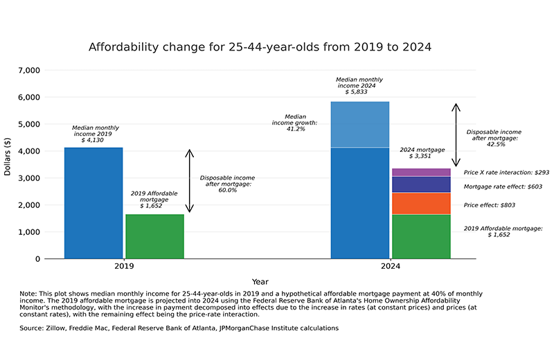
The simplified example depicted in Figure 2 translates these metrics to a hypothetical household budget of a renter seeking to become a homeowner. A mortgage with monthly expenses equal to 40 percent of take-home pay in 2019 would take 58 percent of 2024 take home pay, assuming median growth in incomes.10 This implies that an individual would need to cut non-housing expenses equivalent to a fifth of their take-home pay to buy a home and maintain a balanced budget. This is a substantial challenge, made worse by rising housing-related costs beyond principal and interest. Higher home prices increase downpayments and property taxes, while closing costs and other expenses, like insurance, represent additional hurdles to homeownership.
Figure 2: Rising mortgage burden leaves less disposable income for first-time buyers.
We use methodology from the Federal Reserve Bank of Atlanta’s Home Ownership Affordability Monitor and focus on changes, rather than levels. In place of Census survey data on median incomes over time (a repeated cross-section view), we use median income growth implied by tracking the same group of individuals over time in JPMC data. By focusing on individuals aged 25−44, this view approximates dynamics of the budgeting problem facing typical individuals seeking to become homeowners.
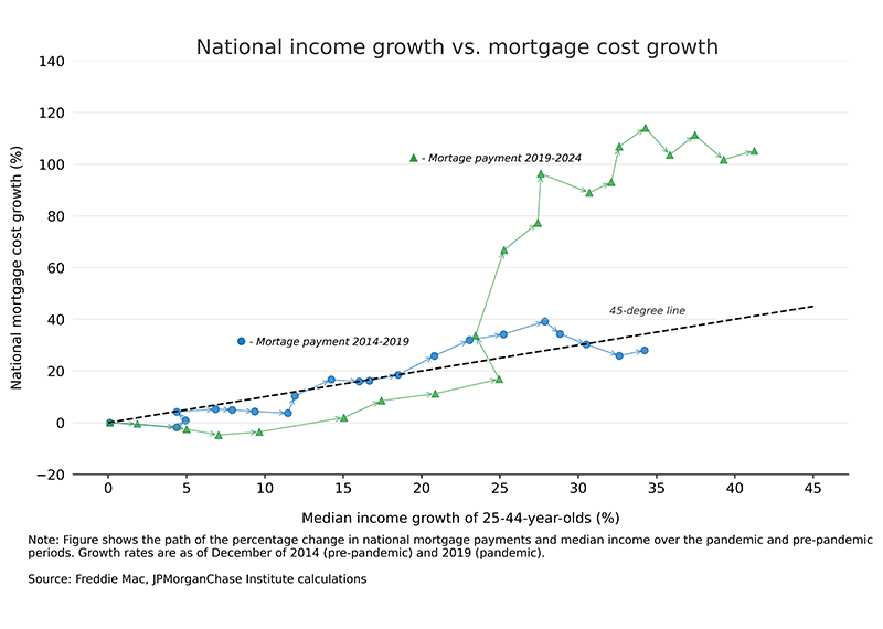
The 2019−2024 period comprises sub-episodes of economic volatility that had distinct effects on affordability. Figure 3 shows change over time in the budget share required to support an equivalent home purchase from a starting point of December 2019. The figure compares the 2019−2024 trend with the same measures applied to 2014−2019 for reference.
Figure 3: Relative to incomes, growth in mortgage payments has increased much more than home prices for those around typical first-time homebuying age.
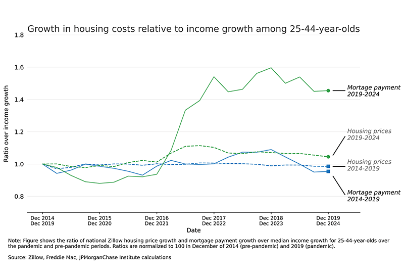
During 2020 and the first half of 2021, affordability improved—income gains outstripped monthly mortgage expenses—supported by falling interest rates from stimulative Federal Reserve policy and fiscal income supports during the pandemic. Deterioration began quickly thereafter, as government income supports faded, while inflation and interest rates rose sharply. The implied mortgage expense budget share rose sharply from mid-2021 through 2023. Since the start of 2024, affordability metrics improved marginally, but stood at very challenging levels relative to 2019. Appendix I provides additional detail, jointly showing both income growth and mortgage cost growth over time.
Over the comparison period of 2014−2019, the monthly cost of a mortgage payment roughly matched median growth of income for individuals in our sample. In effect, individuals attempting to save for years to buy a home ended up with a housing market that had neither surprised to the upside nor downside, on balance.
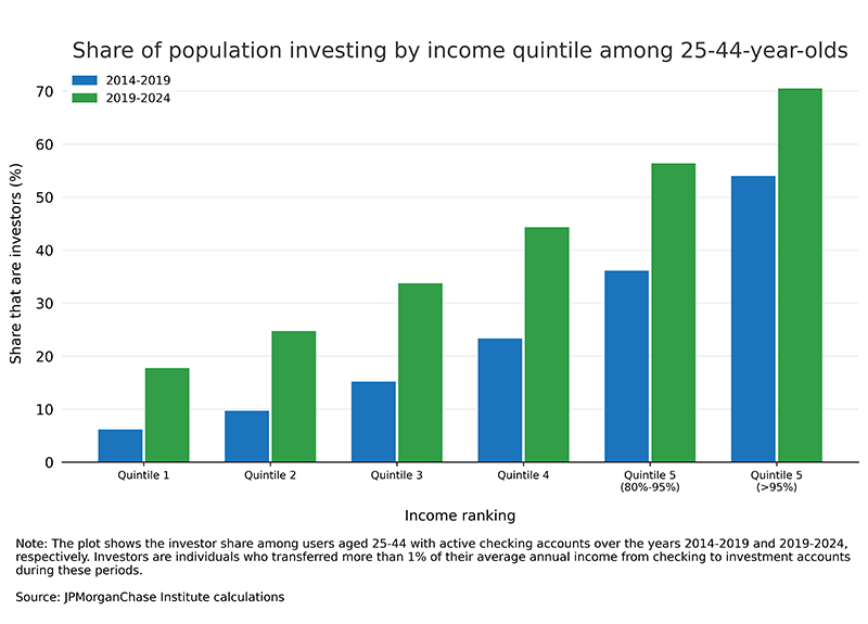
Lower participation in retail investing by low-income 25–44-year-olds limited their ability to use strong stock market gains to support growing down payment needs.
The increase of about 50 percent in home prices 2019−2024 implies a proportional rise in down payments, all else equal. This is a higher hurdle to clear for first-time homebuyers and lower-income individuals generally: they are less likely to have buffers built from previous increases in the housing or stock markets, and they have less wiggle room to lower down payment percentages.11 While substantial growth in retail investing during the pandemic lessens these disparities, purchases of stocks by lower-income individuals came relatively later, meaning they benefited to a lesser degree from the roughly three-fold rise in the S&P 500 index over the 2010s and the near doubling from December 2019 to December 2024 (Wheat and Eckerd 2024b). These patterns echo recent findings on rent inflation, where rising housing costs similarly constrained spending and worsened financial vulnerability, especially among younger, lower-income households.
Figure 4 shows the share of individuals aged 25−44 that save a portion of their take-home pay in financial assets, mainly stocks, across the income distribution.12 The investing share over 2019−2024 was just under 35 percent for individuals in the middle-income quintile (40−59.9 percentile), compared with approximately 70 percent for top-5-percentile earners—a 2X difference. The investing shares for the earlier 2014−2019 period were 15 percent for the middle-income quintile versus 55 percent for the top—a more than 3.5X difference.
As noted in an Institute note on wealth inequality, the reduced gap in stock market participation observed more recently may reduce the potential for further rises in stocks to exacerbate wealth disparities. However, the broadening in stock market participation since December 2019 comes during a time of relatively high valuations. Earlier investors—which were even more tilted towards high-income individuals—benefited to a greater degree from the expansion in stock market valuations.13 In short, lower-income individuals are relatively less likely to keep up with rising downpayment needs by using past stock market gains, either because they don’t own any stocks, or they made purchases at higher valuations.
Figure 4: Higher-income individuals were much more likely to benefit from the rising level of the stock market in recent years, leading to unequal protection against the rising cost of housing.
Housing affordability declined more in areas outside large city centers, with the sharpest declines seen in suburbs, smaller metros, and rural areas.
Market forces and policy have long created differences in housing markets across urban, suburban, and rural neighborhoods.14 For would-be first-time homebuyers, shocks to local housing demand are a source of risk: an unforeseen demand increase in a person’s preferred neighborhood, for example, can lead to price increases that make the location unaffordable. The pandemic-era provides a prime example. Densely populated urban centers faced decreases in demand, while certain suburban and rural housing markets saw demand increases, according to academic research (Ramani and Bloom, 2022; Mondragon and Wieland, 2022).15 Changes in relative home prices in the wake of the pandemic have persisted.
Given the importance of local factors in driving differences in affordability over time, Figure 5 shows changes in home prices relative to median income growth broken out across categories capturing urban city centers, suburbs, and rural areas. We use ZIP code-specific measures of median income growth and compare against data on local home price changes from Zillow. This method better captures welfare shocks that come with changes in local housing market conditions. For example, aggregate local statistics may mistake a relative shift in incomes of people moving to an area for income growth.
Figure 5: Affordability changes have been worse in small metros, suburbs, and rural areas, while densely populated areas in large cities have seen relative improvements over 2019−2024.
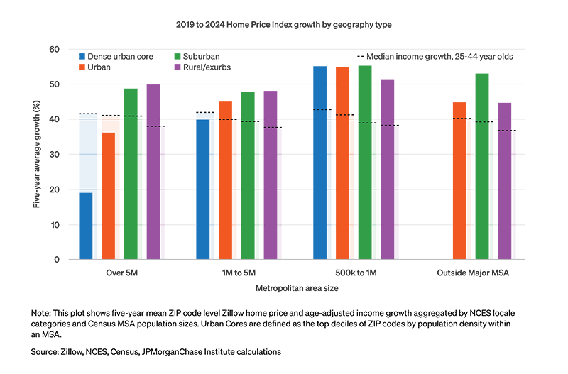
Changes in affordability by area types are somewhat larger than what can be known from prices alone. Gaps are largest between the urban core of large cities and the rest of the housing market. For metro areas with over one million residents, the urban cores experienced the highest income gains but the lowest home price growth. The less-densely-populated areas (suburbs and rural areas) saw both higher home price growth and slightly lower income growth. Small metro areas (500,000 to 1 million people) experienced the worst declines in affordability. Despite similar income growth to the rest of the country, small metros saw the largest increases in home prices. Outside of major MSAs, suburbs experienced relatively worse trends in affordability than the other ZIP code categories.
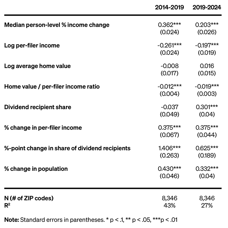
Appendix II shows results from a regression framework that uses additional factors—including IRS data on shifts in income and wealth of tax filers in each ZIP code—to explain differential trends in home prices across locales. Our findings are consistent with Ramani and Bloom (2022), which explores remote work as a driver of housing demand that led to increases in home prices in certain areas. Additionally, home prices relative to local incomes, an indication of overvaluation, played a significant role. Areas with inflated home values compared to incomes tended to experience relative declines in home prices, all else equal.
Housing affordability reached a historically low level due to increases in home prices and interest rates relative to incomes from 2019 to 2024. Unique data used to measure income changes at the individual level more precisely capture the financial challenge facing young individuals seeking to become first-time homebuyers. To buy a comparable home, a household would have to increase its budget allocation to a mortgage payment by 45 percent as of December 2024, compared to December 2019. Lower-income individuals, who have lower rates of homeownership and stock market participation, have been relatively disadvantaged by the rise in asset prices. Geographic differences in affordability dynamics have been notable since the pandemic. The densely populated urban centers of large cities have experienced notably less home price appreciation relative to the suburbs and more rural areas.
The decline in housing affordability is feeding into disparities in financial health. A study of retail spending broken down by homeownership status shows divergent trends (Hacıoğlu et al., 2024). Those who owned homes prior to the pandemic have seen higher growth in spending since the start of 2023 than renters or those that became homeowners during 2022, when prices and interest rates were already rising. Perceptions of overall economic conditions may also be influenced by housing affordability challenges, as suggested by recent academic research.16 However, it’s challenging to disentangle housing from related factors, such as higher consumer prices and interest rates, generally.
Finally, shocks to home prices and interest rates described in this report carry implications for wealth inequality. High inflation and rising asset prices, as seen during the 2019–2024 period, can widen gaps due to balance sheet differences across the population. Those that invest a significant amount of their wealth in stocks and housing tend to benefit, while households preserving savings in lower-risk assets, like cash, often see the value of their holdings depreciate in terms of purchasing power. The specific nature of the pandemic added another fault line: existing homeowners in the suburbs benefitted relative to homeowners in dense urban centers. These findings can help make sense of the differences in households’ experiences in the wake of the substantial volatility in recent years.
Figure 6 below provides additional detail, tracking separately the paths of the primary components of affordability: mortgage costs and incomes. Analogous to the discussion in Figure 3 from Finding 1, the figure shows a favorable trend from December 2019 through December 2021—when nominal incomes were up 25 percent against a 20 percent increase in implied mortgage expenses. In 2022 and 2023, the cumulative growth in housing costs rose about 100 percentage points against a further rise in the income growth rate of just over 10 percentage points. By contrast, the 2014−2019 period featured minimal gaps between income and mortgage cost growth.
Figure 6: Home prices increased notably faster than the median change in incomes for those around typical first-time homebuying age.
This section presents results from ZIP code-level regression analysis of factors that are associated with home price growth. In addition to the new perspective available with within-person income growth measures, ZIP code-level data from the IRS Statistics of Income provide additional clarity on affordability changes.17 We use a regression framework to quantify the relationships between home prices and income growth, in conjunction with public data aggregated at the ZIP code-level. Specifically, we model changes in local home prices from Zillow as a function of the following: JPMC data on median individual-level income growth of residents at the start of the period and IRS data showing net changes in tax filers and changes in the income and wealth level of residents. We also use a proxy for housing market valuation at the start of the period using home prices (Zillow) relative to average per-person income (IRS). As a caveat, the variables used in the regression exercise may be noisy indicators of the factors that really matter for home prices.
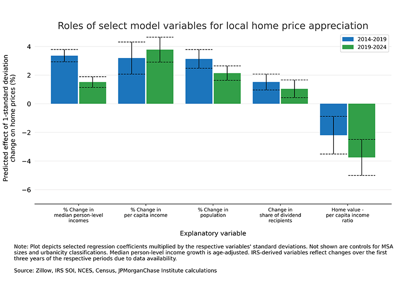
Individual-level income growth, the income variable used in the main analysis of affordability, shows up with the expected positive relationship with local home prices. The regression explains roughly 45 percent of the variation in home price changes 2019−2024. However, this represents roughly a 15-percentage point drop from the baseline 2014−2019 period, suggesting an increased role of other factors in driving recent changes in home prices. Still, the regression may be useful for gauging the relevance of the following dynamics, summarized in Figure 7 and the regression table below:
Figure 7: Shifts in individuals moving to an area help explain relative home price increases from 2019−2024, while areas with existing affordability challenges appreciated by less.
Regression table: Factors explaining ZIP code-level home price changes (in percent) over 2014−2019 and 2019−2024.
Been, V., Ellen, I. G., and O’Regan, K. (2019). Supply Skepticism: Housing Supply and Affordability. Housing Policy Debate, 29(1), 25-40. https://doi.org/10.1080/10511482.2018.1476899
Glaeser, Edward L. and Gyourko, Joseph E. (2003). The Impact of Building Restrictions on Housing Affordability. Economic Policy Review, Vol. 9, No. 2, June 2003, Available at SSRN: https://ssrn.com/abstract=790487
Hacıoğlu Hoke, Sinem, Leo Feler, and Jack Chylak (2024). A Better Way of Understanding the US Consumer: Decomposing Retail Sales by Household Income. FEDS Notes. Washington: Board of Governors of the Federal Reserve System, October 11, 2024, https://doi.org/10.17016/2380-7172.3611.
Mondragon, John and Johannes Wieland. (2022). Housing Demand and Remote Work. Federal Reserve Bank of San Francisco Working Paper 2022-11. https://doi.org/10.24148/wp2022-11
Ramani, Arjun and Nicholas Bloom. (2022). The Donut Effect of COVID-19 on Cities. NBER Working Paper Series. https://www.nber.org/papers/w28876
Wheat, Chris and George Eckerd. (2024a). The purchasing power of household incomes: Worker outcomes through July 2024 by income and race. JPMorganChase Institute. https://www.jpmorganchase.com/institute/all-topics/financial-health-wealth-creation/the-purchasing-power-of-household-incomes-worker-outcomes-through-july-2024-by-income-and-race
Wheat, Chris and George Eckerd. (2024b). The Rise in Retail Investing: Roles of the Economic Cycle and Income Growth. JPMorgan Chase Institute. https://www.jpmorganchase.com/institute/research/financial-markets/the-rise-in-retail-investing-roles-of-the-economic-cycle-and-income-growth
Wheat, Chris, Melissa O’Brien, and George Eckerd. (2024). Retail risk: Investors’ portfolios during the pandemic. JPMorganChase Institute. https://www.jpmorganchase.com/institute/all-topics/financial-health-wealth-creation/retail-risk-investors-portfolios-during-the-pandemic
We thank our research team, especially Guillaume Kasten-Sportes, for his contributions to the analysis. We also thank Sarah Kuehl, Liz Ellis, Bryan Kim, Oscar Cruz, and Alfonso Zenteno for their support. We are indebted to our internal partners and colleagues, who support delivery of our agenda in a myriad of ways and acknowledge their contributions to each and all releases.
We would like to acknowledge Jamie Dimon, CEO of JPMorganChase, for his vision and leadership in establishing the Institute and enabling the ongoing research agenda. We remain deeply grateful to Peter Scher, Vice Chairman, Tim Berry, Head of Corporate Responsibility, Heather Higginbottom, Head of Research & Policy, and others across the firm for the resources and support to pioneer a new approach contributing to global economic analysis and insight.
This material is a product of JPMorganChase Institute and is provided to you solely for general information purposes. Unless otherwise specifically stated, any views or opinions expressed herein are solely those of the authors listed and may differ from the views and opinions expressed by J.P. Morgan Securities LLC (JPMS) Research Department or other departments or divisions of JPMorgan Chase & Co. or its affiliates. This material is not a product of the Research Department of JPMS. Information has been obtained from sources believed to be reliable, but JPMorgan Chase & Co. or its affiliates and/or subsidiaries (collectively J.P. Morgan) do not warrant its completeness or accuracy. Opinions and estimates constitute our judgment as of the date of this material and are subject to change without notice. No representation or warranty should be made with regard to any computations, graphs, tables, diagrams or commentary in this material, which is provided for illustration/reference purposes only. The data relied on for this report are based on past transactions and may not be indicative of future results. J.P. Morgan assumes no duty to update any information in this material in the event that such information changes. The opinion herein should not be construed as an individual recommendation for any particular client and is not intended as advice or recommendations of particular securities, financial instruments, or strategies for a particular client. This material does not constitute a solicitation or offer in any jurisdiction where such a solicitation is unlawful.
Wheat, Chris, and George Eckerd. 2025. “The Affordability Gap: Is home ownership still within reach in today’s economy?” JPMorganChase Institute. https://www.jpmorganchase.com/institute/all-topics/community-development/the-affordability-gap-is-home-ownership-still-within-reach-in-todays-economy.
Authors

Chris Wheat
President, JPMorganChase Institute

George Eckerd
Research Director for Wealth and Markets, JPMorganChase Institute
Footnotes
Data available here: https://www.newyorkfed.org/microeconomics/sce/housing#/housing_prices_17.
See FRED plot linked here, with the FHFA All Transactions Home Price Index, the S&P CoreLogic Case-Shiller National Home Price Index, and the Consumer Price Index: All Items, indexed to December 2019 levels.
Based on JPMorganChase data covering millions of individuals’ take-home pay.
Wheat and Eckerd (2024a).
This does not imply that the share of housing in budgets has declined—studies have found a slight rise—as individuals may demand more or higher quality housing as real incomes rise. Data from the Census Bureau show a steady rise in average square footage for housing units from the 1970s through the mid-2010s. The perspective in this report uses home prices changes that attempts to hold housing size and quality constant.
This calculation, and Figure 1, considers overlapping five-year intervals. For example, the 2001−2006 window is followed by 2002−2007 and so forth.
According to the CFPB.
See Consumer Financial Protection Bureau report, Market Snapshot: First-time Homebuyers. The median age of first-time homebuyers was 32 as of 2018.
The majority of renters prefer to own a home, and despite the little change in renters’ preference to own since 2019, respondents’ probability of buying has fallen from 53 percent to 34 percent, an all-time low for the series going back to 2015, according to the New York Fed’s Survey of Consumer Expectation’s Housing Survey.
The Atlanta Fed’s Home Ownership Affordability Monitor uses a mortgage payment affordability definition of 30 percent, using gross income. Since our income measure is on take-home pay, we use a baseline 40 percent budget share, which effectively assumes take-home pay is in the ballpark of 75 percent of the gross figure.
In 2024, the median down payment was 9 percent of home value for first-time homebuyers and 23 percent for repeat homebuyers.
As described in Wheat, O’Brien, and Eckerd (2024) funds transferred to investment accounts are mainly allocated to the stock market.
For example, the Cyclically Adjusted Price-to-Earnings Ratio, published by Yale’s Robert Shiller, rose from about 20 in January 2010 to about 30 in December 2019. The ratio in April 2025 was 33.
See, for example, Glaeser and Gyourko (2003) and Been et al. (2019).
See also Housing Insights: COVID-19 Led First-Time Homebuyers to Move Away from Highly Dense City Centers, report by Fannie Mae (March 2021) and Moving to the Country: Unpacking the Persistent Increase in Rural Housing Demand Since the Pandemic by Fannie Mae (November 2024).
For example, Stantcheva (2024) and Bolhuis et al. (2024) discuss the role of high inflation in driving consumer sentiment lower. Relatedly, policymaker research on the topic has referenced increased discussion of economic despair on social media.
The latest available IRS Statistics of Income data are for the 2022 tax year, as of March 2025. The regression of 2019−2024 home price changes uses changes over 2019−2022 for the IRS-derived variables.