
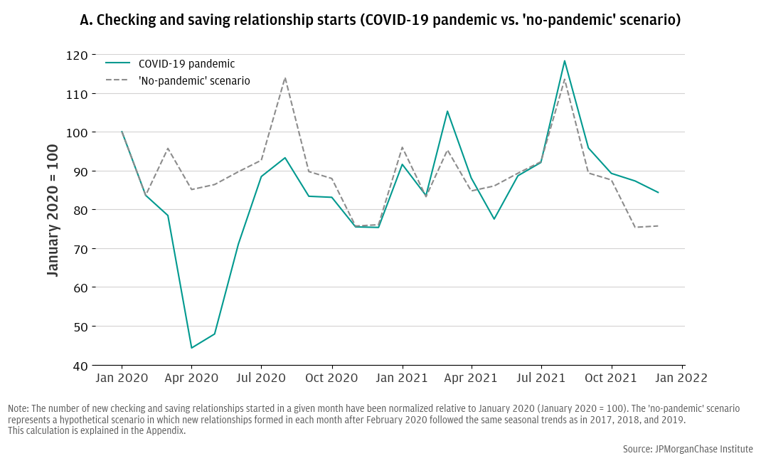
Figure 1. Comparing new deposit relationship starts to a hypothetical “no-pandemic” scenario to estimate the COVID-19 disruption.
Latest news

An Ohio-based company is protecting first responders around the world
With support from JPMorganChase, Fire-Dex is providing protective equipment to firefighters in 100 countries and all 50 states.
Learn moreLatest news

Veteran’s Unconventional Path to Landing her Dream Job in Tech
U.S. Army Veteran Ashley Wigfall transitioned to a civilian role and charted her path to technologist through mentorship and skills training at the JPMorgan Chase tech hub in Plano, Texas.
Learn more
Research
August 14, 2025
Six percent of U.S. adults (over 15 million people) remained “unbanked” in 2023—lacking easy access to personal funds and a quick and secure means to transact and save money.1 Given the importance of these benefits, policymakers have prioritized increased access to bank accounts recent years.2 In particular, policies seeking to support transitions away from being unbanked might leverage “bankable moments”—specific circumstances that provide opportunities for people to open a bank account.
This report explores how the turmoil of the COVID-19 pandemic and its associated economic relief programs may have created such a bankable moment. We explore how the creation of new banking relationships was disrupted and changed, in particular among Black, Hispanic, and low-to-moderate income consumers—consumers that had higher rates of being unbanked and were also the most severely economically impacted groups during COVID-19.3
Our focus on deposit relationship formations raises questions regarding banking access, affordability, and inclusion. Findings are consistent with existing hypotheses that federal pandemic-related assistance programs motivated and/or enabled sustainable bank account adoption among unbanked consumers and has implications for contemplating the affordability of bank deposit products as a hurdle to bank account adoption.
Bank accounts provide easy access to personal funds and a quick and secure means of making financial transactions. In addition, the U.S. Treasury Department has prioritized access to transaction accounts with its national financial inclusion strategy.4 Yet, six percent of the U.S. adult population was “unbanked” in 2023, and there are higher unbanked rates among households making less than $25,000 in annual income (23 percent), Black adults (14 percent), and Hispanic adults (11 percent).5 While there are a variety of reasons unbanked individuals report not having a bank account, the FDIC has suggested that “bankable moments,” or “[e]vents or points in time when a consumer has an increase or change in their regular, day-to-day cash flow, such as when receiving benefits or starting a new job,” can provide an impetus for unbanked individuals to open a bank account.6 Given the large disruptions to economic conditions and the federal government’s pandemic-relief cash transfer programs, the COVID-19 pandemic and its associated relief programs present a unique opportunity to study how such events impact consumer connection to the banking system.
We explored how the creation of new banking relationships was disrupted and changed during the COVID-19 pandemic beginning March 2020, and the impact on the creation of new banking relationships among Black, Hispanic, and low-to-moderate income consumers. On the one hand, we might expect that the banking access of Black, Hispanic, and/or low-to-moderate income consumers was more severely disrupted than other groups due to the higher levels of unemployment and economic uncertainty, coupled with lower levels of digital/internet access available to those communities during a time when many economic activities, including banking, shifted to digital.7 On the other hand, cash reserves held in banks rose at the fastest rate in more than 50 years in response to pandemic-related federal economic assistance programs, and the FDIC has suggested those payments provided a bankable moment for unbanked households.8
Using anonymized Chase retail banking data, we tracked deposit account adoption at a monthly frequency through approximately the first year and a half of the COVID-19 pandemic, which allowed us to observe the dynamics of account adoption during that time.9 In contrast to studies focused on bank account balances as a measure of savings and spending behaviors during the pandemic, to the extent that the additional liquidity made available by federal programs played a role in helping unbanked individuals establish new banking relationships, our focus on deposit relationship formations has implications for understanding banking access, affordability, and inclusion.
We found:
Our findings are consistent with the hypothesis that federal pandemic-related assistance programs could have motivated and/or enabled bank account adoption among unbanked lower income, Black, and Hispanic consumers, and they have implications for contemplating the affordability of bank deposit products as a hurdle to bank account adoption.
Utilizing anonymized data from Chase Bank, we constructed a monthly time series of “new deposit relationships,” defined as instances where a customer became an account owner of a personal checking and/or savings account at Chase in the absence of already owning a personal checking or savings account with Chase.10 Our data ultimately represented the number of new deposit relationships formed with Chase on a monthly basis from 2017 through 2021. We created a time series for all new deposit relationships, as well as series disaggregated by product type (checking vs. savings) and customer characteristics, including race and household income.11
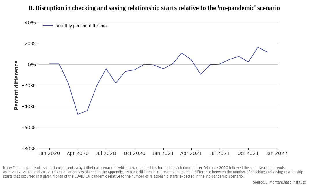
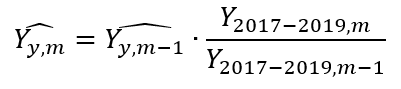
To illustrate the disruption of new deposit relationships during the COVID-19 pandemic, we compared our time series of new deposit relationships during 2020 and 2021 to a time series representing a hypothetical “no-pandemic” scenario where, beginning in February 2020, monthly new deposit relationships followed historical month-over-month patterns of change (see Figure 1, Panel A).12 Figure 1, Panel B measures the disruption in new deposit relationship formations as the percent difference between new deposit relationships in each month and the “no-pandemic” scenario, where values of zero indicate that new deposit relationships in that month were the same as the “no-pandemic” scenario, and positive (negative) values indicate that more (fewer) new relationships were formed in that month than in the hypothetical scenario. A positive (negative) slope indicates that the month-to-month change in relationship formations was more positive (negative) than historical month-to-month change (i.e., new relationship formations increased more quickly—or slowly for negative slopes—than in the past).
The pandemic initially disrupted new bank account openings across all income and race groups.
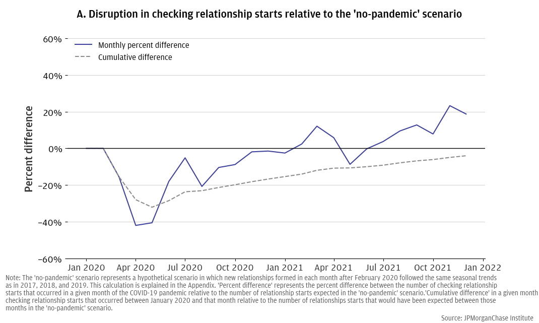
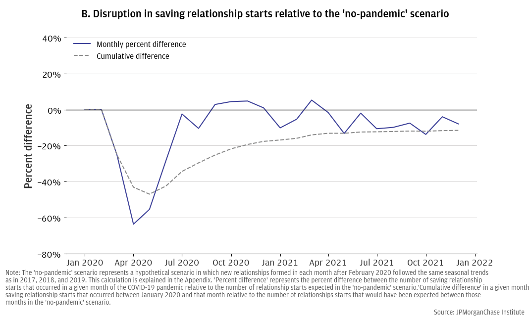
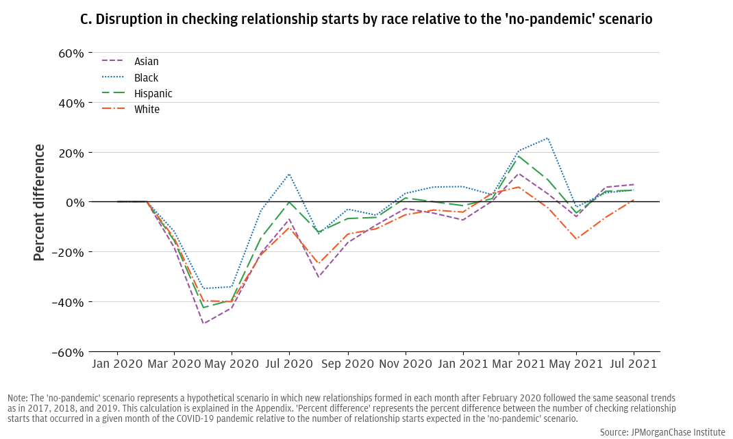
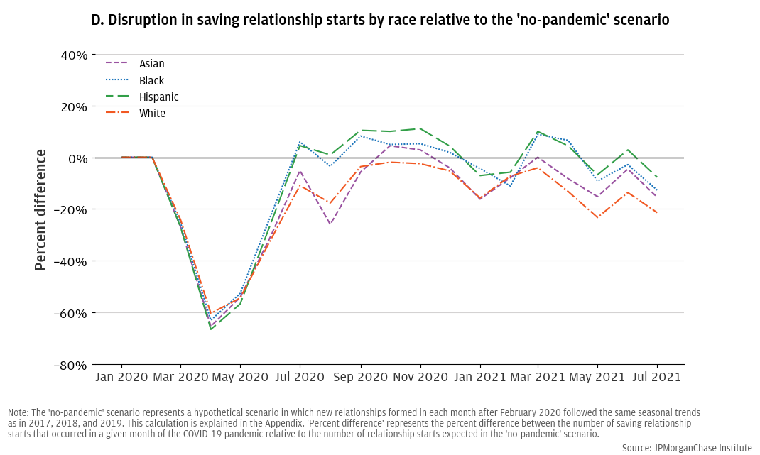
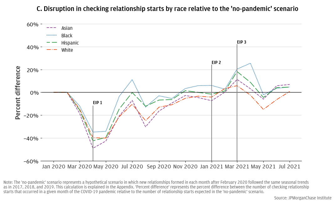
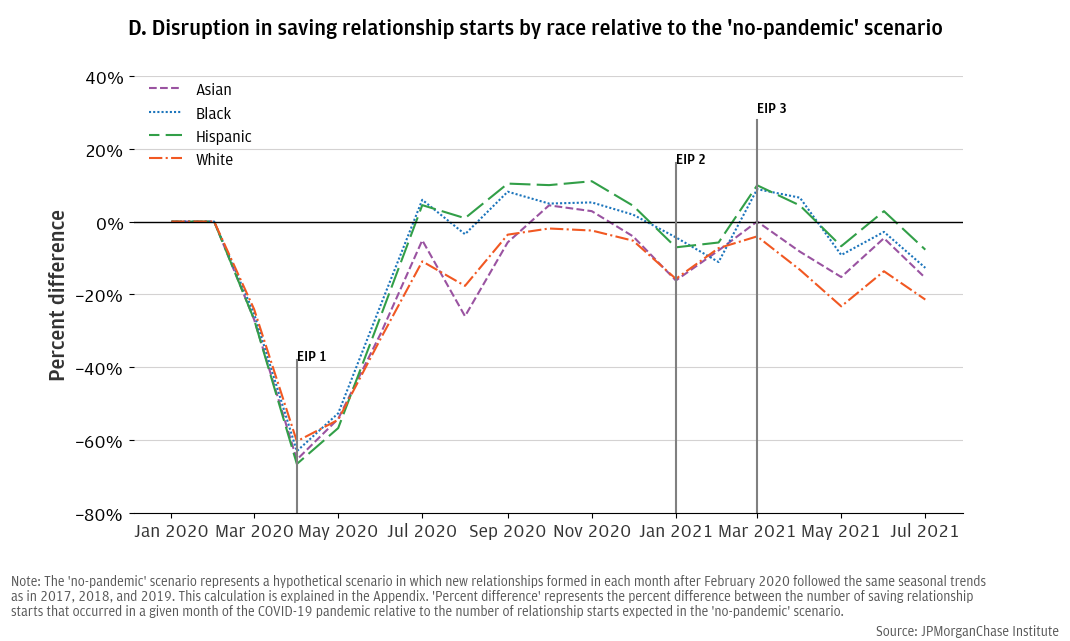
Figure 2 contrasts the disruption to new checking relationship formations against the disruption to new saving relationship formations during 2020 and 2021, showing that, despite a severe decline in March, April, and May 2020 for both account types, the impact on checking relationship formations was less severe than savings relationships: there were approximately 40 percent fewer checking account relationships formed in April 2020 than in the “no-pandemic” scenario, versus a 60 percent difference among savings account relationships. This difference may reflect the essential transaction services that checking accounts provide, which may have caused people to still open checking accounts, even in times of economic turmoil.
In 2021, new checking relationships trended upward relative to the “no-pandemic” scenario (i.e., the month-to-month change was more positive than historical trends and new relationships were higher than the “no-pandemic” scenario in most months), whereas, new savings relationships leveled off and may have even fallen behind the “no-pandemic” scenario.13 Tracking the disruption’s cumulative impact, Figure 2, Panel A estimates that the number of new checking relationships formed between February 2020 and the end of 2021 was nearly the same as predicted by our “no-pandemic” scenario, whereas, Figure 2, Panel B shows that cumulative savings relationships still fell short of the “no-pandemic” scenario at the end of 2021. These contrasting trends could reflect changes in how customers preferred to manage their cash as a result of the macroeconomic and market conditions present at the time (e.g., consumers may have had fewer incentives to start savings account relationships at new banks or sought alternative opportunities to earn returns on cash savings after the Federal Reserve cut interest rates in March 2020).14
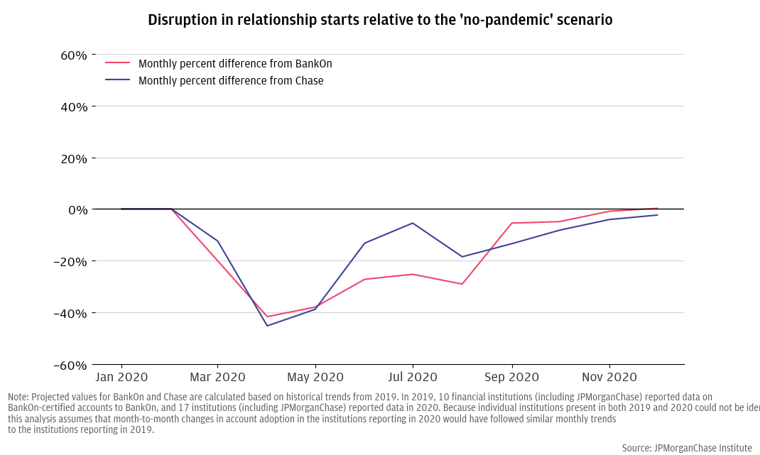
To address potential concerns that the results in Figure 2 might reflect Chase business performance during our analysis window rather than an industry-wide phenomenon, we performed the same analysis on publicly available data from other institutions reporting to the Bank On National Data Hub.15 Figure 3 demonstrates that other institutions offering deposit products also experienced a severe disruption in March, April, and May of 2020 with a gradual recovery, suggesting that this phenomenon was not unique to Chase. More details regarding this analysis are available in the discussion of our robustness tests in the Appendix.
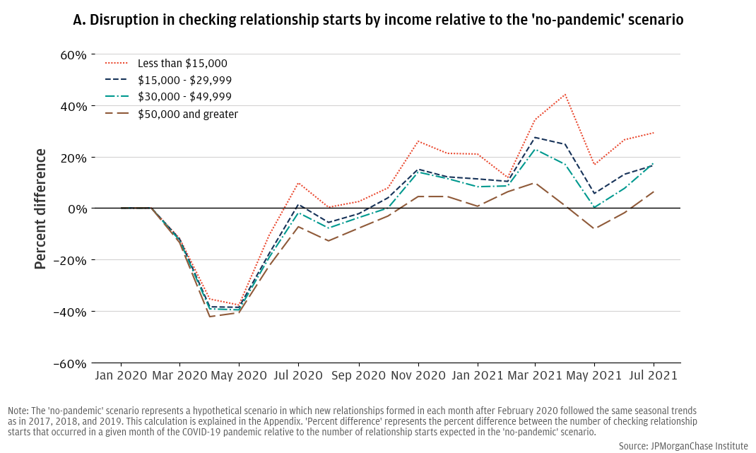
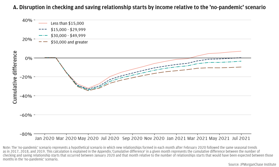
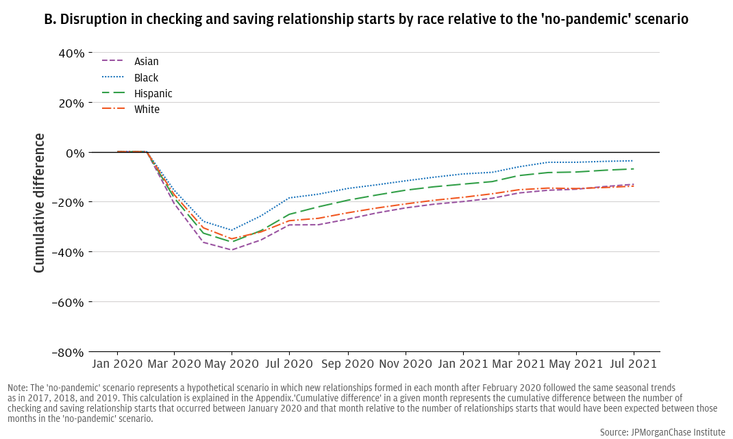
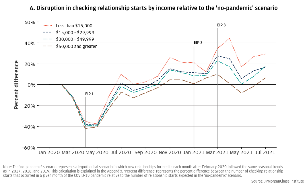
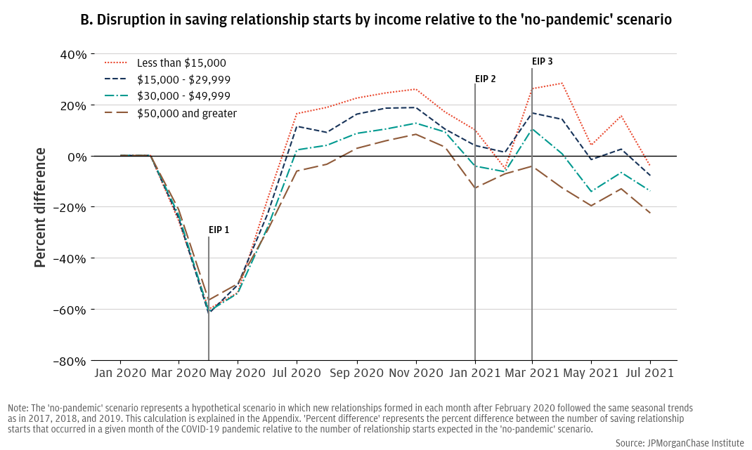
During the first year of the pandemic, opening deposit accounts with a new bank (i.e., “deposit relationship formation”) was most robust among Black and Hispanic consumers and people with household income below $15,000 (relative to a “no-pandemic” scenario).
A strong recovery in deposit relationship formations in June and July 2020 followed the initial disruption. Some demographic groups rebounded more swiftly than others (i.e., the percent difference between monthly relationship formations and the “no-pandemic” scenario approached and sometimes exceeded zero). Both checking and savings relationships among lower income, Black, and Hispanic consumers outpaced historic patterns more strongly and consistently during late 2020 and early 2021 than other groups (i.e., monthly relationship formations exceeded the “no-pandemic” scenario for lower income, Black, and Hispanic groups more strongly and in more months than for other groups), with a particularly robust acceleration of account adoption in March and April 2021.19
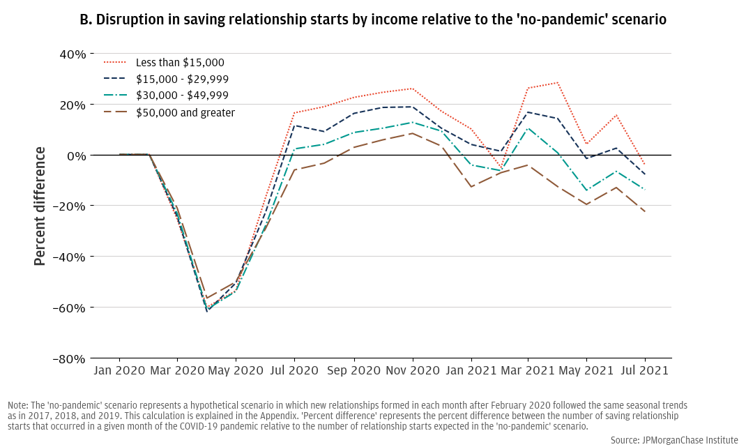
By mid-2021, more people with household income below $15,000 had started new deposit relationships than would have in a “no-pandemic” scenario.
Figure 5, Panel A shows that by early 2021 more consumers in households with annual income below $15,000 started new banking relationships than would have been expected in the “no-pandemic” scenario. Results indicate some consumers in that group started an account during the pandemic when they would not have done so in the “no-pandemic” scenario.20 This finding is consistent with the notion that a “bankable moment” may have occurred during the pandemic and, on net, enhanced the number of new banking relationships generated by members of low-income households.21 Figure 5, Panel B is less conclusive on this issue by customer race, though it does show that nearly the same number of Black and Hispanic consumers (respectively) started new banking relationships by July 2021, as would have in the “no-pandemic” scenario, while, on net, some Asian and White consumer relationships were displaced by the pandemic.
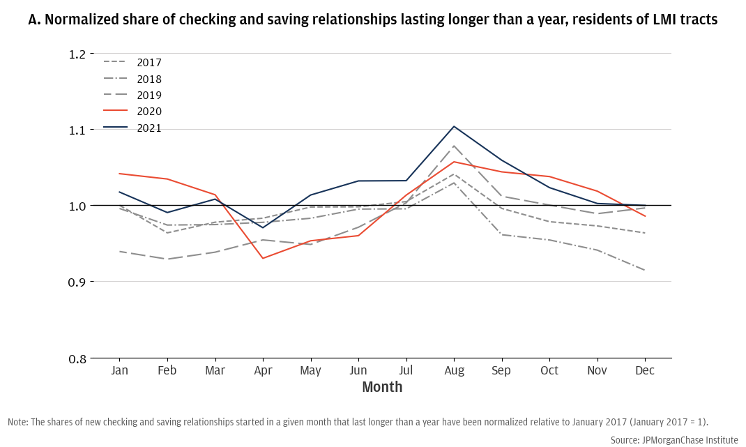
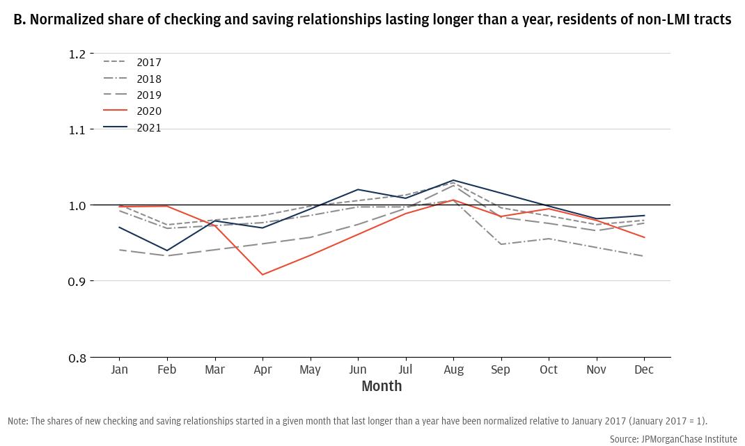
People starting new deposit relationships from low-to-moderate income areas in late 2020 and early 2021 had elevated likelihoods of retaining their accounts for more than a year.
Figure 6 contrasts the stability of 2020 and 2021 new deposit relationships with historical measures from 2017, 2018, and 2019 (all values of our stability metric have been normalized relative to January 2017). Panel A shows the results for customers living in low-to-moderate income (LMI) areas, while Panel B shows customers living in non-LMI areas.22 These charts show that there was a decline in the 12-month stability of relationships started in the second quarter of 2020 for all new customers: a smaller share of customers starting new deposit relationships during the second quarter of 2020 kept those accounts for 12 months or longer. However, during the second half of 2020 through 2021, customers from LMI areas had equal or higher rates of 12-month stability than historic levels. That is, members of LMI communities who started new deposit relationships in late 2020 and early 2021 had elevated likelihoods of maintaining their relationship for more than a year relative to historical patterns. In contrast, members of non-LMI communities did not show the same elevation in relationship stability during those months.
The FDIC has posited that Economic Impact Payments (EIPs) and other pandemic-related assistance programs created a “unique bankable moment,” in which unbanked consumers were incentivized to become banked, in order to receive payments quickly and securely via direct deposit.23 In fact, FDIC (2021) found that 35 percent of households who transitioned from unbanked to banked status between March 2020 and June 2021 reported doing so in part due to a government benefit payment.
Our analyses show that, following a severe disruption to new bank account openings at onset of the pandemic, groups with historically lower rates of bank account ownership (lower-income, Black, and Hispanic consumers) had a stronger uptake of new accounts (relative to a “no-pandemic” scenario) than other income and race groups. Further, by March 2021, more members of low-income households (making less than $15,000 annually) opened accounts than predicted by the “no-pandemic” scenario, consistent with a “bankable moment,” encouraging them to open accounts when they otherwise would not have. Last, we found that consumers from LMI communities who started new deposit relationships in late 2020 and early 2021 had elevated rates of 12-month engagement with their accounts in ways that members of non-LMI communities did not, suggesting that those accounts may have been more stable than accounts opened by previous cohorts of LMI customers. While these results do not explicitly measure the number of new banking customers responding to the bankable moment presented by pandemic-related assistance, they are consistent with the hypothesis that some unbanked consumers may have opened new deposit accounts and maintained them as a result of the cash made available to them through the EIPs and other pandemic-related assistance.
Figure 7 overlays the charts from Figure 4 with the disbursal timing of the pandemic EIPs. This figure shows that, as early as the second quarter of 2020, there was a stronger pattern of new banking relationship formations (relative to the “no-pandemic scenario”) among lower income, Black, and Hispanic consumers following the first EIP, with notable increases in March and April 2021, coinciding with the disbursal of the third EIP (which was also the largest EIP).24 Combined with results in Figure 5, which showed that by March 2021 (the timing of the third EIP), more lower income consumers had started new banking relationships over the course of the pandemic than expected by the “no-pandemic” scenario, this finding is consistent with the FDIC’s suggestion that EIPs and other pandemic assistance created bankable moments for unbanked populations.
It is noteworthy that our results showed elevated adoption activity for those groups during the months between EIPs and not only around the timing of initial EIP disbursals. The FDIC has suggested that bank account adoption by unbanked households during the pandemic may have been driven by the desire to receive pandemic-related assistance by direct deposit, which allows for quick and secure receipt of funds. This would mean that many account openings of that type should occur when consumers are anticipating receipt of their EIP (or other pandemic assistance), yet we observe some lag between the beginning of the first EIP’s disbursal and the uptick in relationship formations by low-income, Black, and Hispanic consumers (relative to the “no-pandemic scenario”). This could reflect delays in EIP receipt, which would have caused these groups to continue receiving their EIP deposits through late 2020, or it could reflect customers opening accounts after having received their EIP and finding they had excess liquidity to place in a bank. It is unlikely to include account openings in anticipation of future EIP payments, since the second and third EIPs were approved shortly before their disbursals. Customers may also have delayed opening a bank account during the second quarter of 2020 when consumer activity in general was severely depressed.
These findings could have implications for financial inclusion strategies aimed at helping consumers connect with financial institutions and transaction accounts, including the Treasury Department’s National Strategy for Financial Inclusion.25 Even as the national unbanked rate continues to decline, there is still room for further reduction by improving customer retention. For example, the FDIC found that 53 percent of unbanked households in 2023 had been banked in the past. Approximately 11 percent of unbanked households in June 2023 had been banked during the previous 12 months.26 Further, approximately 6 percent of banked households were banked during the previous 12 months, demonstrating the transitory nature of banking relationships for some households.27 In our data, we found evidence that lower-income consumers who started new banking relationships in late 2020 and 2021 had more stability in their account ownership than previous cohorts of lower-income customers. This finding may result because the programs and/or support that encouraged new customers to open bank accounts during that time also helped them sustain their account relationships. Given data that show availability of sufficient funds to start or maintain a bank account was the most commonly cited reason for not having a bank account, “bankable moments,” such as the EIPs, may offer liquidity that makes it easier to manage the expense of a bank account.28 Additional research could evaluate whether new customers were able to sustain deposit relationships as liquidity from pandemic-related aid depleted over time.
A. Construction of the “no-pandemic” hypothetical scenario
To measure the disruption to deposit relationship formations, we compared the number of new deposit relationships in a given month to a constructed hypothetical “no-pandemic” scenario where, beginning in March 2020, new deposit relationships followed historical month-to-month trends based on data from 2017, 2018, and 2019. In the equation below, Yy,m is the “no-pandemic” number of new deposit relationships that would have started in year y, month m, for y E {2020, 2021}, m E {3, 4, 5, 6, 7, 8, 9, 10, 11, 12} and Yy,m is the actual number of new banking spells in year y and month m:
Equivalently, to project a hypothetical scenario for January 2021, we applied the month-over-month changes between December 2017, 2018, and 2019 and January 2018, 2019, and 2020 to the hypothetical scenario for December 2020. To project the scenario for February 2021, we applied month-over-month changes from between January 2018, 2019, and 2020 and February 2018, 2019, 2020 to the hypothetical value for January 2021. (As discussed, our analyses disaggregated by customer characteristics end in July 2021 and only utilized data from February 2017 through July 2019 to calculate the “no-pandemic” scenario).
Given some of the limitations of our data, we conducted multiple robustness tests of our results.
First, one might wonder if our analyses reflect Chase business performance during our analysis window, rather than industry-wide trends. To test this issue, we applied our analytical approach to public data provided by the Bank On National Data Hub.29 This analysis showed that other institutions offering deposit products also experienced a severe disruption in March, April, and May of 2020 with a gradual recovery, suggesting that this overall phenomenon was not unique to Chase. Figure 3 compares the disruption of Bank On-certified accounts to that of Chase checking accounts, since both are primarily transactional accounts.30 The similarities between the two suggest that, while it is possible that the exact shape of the disruption and recovery observable in our data may reflect some nuances specific to Chase’s operations, general trends related to the pandemic disruption and recovery were significant and occurred across numerous financial institutions and deposit products.
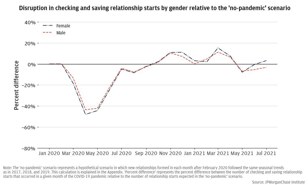
Second, we tested whether the distinct patterns of account adoption across race and income groups shown in Figure 4 were unique to the COVID-19 period or may have occurred in other years—either due to specific Chase activities or spuriously due to noise in the data. These “placebo tests” compared the formation of deposit relationships in non-pandemic years (e.g., 2018) to a hypothetical scenario based on historical trends. We also conducted a placebo test comparing male and female account adoption: these groups do not have pronounced differences in bank account ownership, and we consequently would not expect them to have pronounced differences in account openings in 2020 and 2021. None of our “placebo tests” indicated that our results in Figure 4 are replicable in other recent years or across gender groups.
Figure A1 provides an example of our placebo tests, in which we compared the formation of checking relationships in 2018 to a hypothetical scenario based on 2017 trends.31 Although the chart shows that checking relationship formations outpaced predictions based on 2017 trends (shown by the positive values when comparing monthly 2018 relationship formations to the hypothetical scenario), all income segments followed a similar pattern, with minimal heterogeneity across income groups. Our other placebo tests were similar, though some did show a slight, gradual separation between market segments. We encourage readers to focus on the general patterns of disruptions shown in our analyses and the patterns of sharp heterogenous disruptions and recoveries across products and consumer groups.
Similarly, Figure A2 shows the result of performing this analysis by gender, where we would not necessarily expect to see a difference in account adoption if the main driver was a response to a “bankable moment.”
Third, we explored the possibility that our results reflect a response to Chase’s $30 Billion Racial Equity Commitment, which was announced in October 2020 and included a goal to improve financial access to banking in Black and Hispanic communities and a commitment to expand its branch network in low- to moderate-income communities.32 Although this commitment was made in late 2020 (after rates of relationship formation started to differ across income and race groups according to our analyses), Chase’s efforts could be reflected in our results if Chase began pursuing some of its strategies before the formal Racial Equity Commitment was announced. We conducted a robustness check to account for Chase’s branch expansion strategy by limiting our sample to people who started banking relationships in ZIP codes where Chase had a constant number of branches between January 2017 and December 2021.33 Our findings remained the same, suggesting that Chase’s branch expansions may not be responsible for our results.
Last, issues with the availability of demographic data caused us to end our analyses or race and income in July 2021 and exclude data from August 2019 through December 2019 from the calculation of the “no-pandemic” hypothetical scenarios in those analyses. We made those adjustment because systematic changes over time in how or why demographic data is missing could cause our results to be biased in some way. While our “placebo tests” suggest that this issue is limited once late 2019 is excluded from the data, we caution readers to focus on the relative movements across race and income groups in the disruption (or recovery) of deposit relationships rather than the precise numeric values assigned to the disruption (or recovery) in any given month.
We are thankful to the many people who made essential contributions to this research. The data and analyses presented in this report were prepared by Laura Wilcox and Nich Tremper under our direction. Laura Wilcox also provided drafting support. We also thank Liz Ellis, Julia Decerega, Alfonso Zenteno, Oscar Cruz, Chris Crossen, and Chris Wong for their production support. In addition, we are indebted to our internal partners and colleagues, who support delivery of our agenda in a myriad of ways and acknowledge their contributions to each and all releases. In particular, we thank Makada Henry Nickie, Alex Cawthorne Gaines, and Malavika Krishnan for their helpful comments.
We would like to acknowledge Jamie Dimon, CEO of JPMorganChase, for his vision and leadership in establishing the Institute and enabling the ongoing research agenda. We remain deeply grateful to Peter Scher, Vice Chairman, Tim Berry, Head of Corporate Responsibility, Heather Higginbottom, Head of Research, Policy and Insights, and others across the firm for the resources and support to pioneer a new approach contributing to global economic analysis and insight.
“2021 Summary of Deposits Highlights.” FDIC Quarterly. Federal Deposit Insurance Corporation, 2022. https://www.fdic.gov/system/files/2024-06/article2.pdf.
“Annual Report.” JPMorgan Chase & Co., 2020. https://www.jpmorganchase.com/content/dam/jpmc/jpmorgan-chase-and-co/investor-relations/documents/annualreport-2020.pdf.
Baker, Scott, Nicholas Bloom, Steven Davis, and Stephen Terry. “COVID-Induced Economic Uncertainty.” Cambridge, MA: National Bureau of Economic Research, 2020. https://doi.org/10.3386/w26983.
“Bank On,” n.d. https://www.stlouisfed.org/community-development/bank-on-national-data-hub.
“BankFind Suite.” Federal Deposit Insurance Corporation, August 6, 2024. https://banks.data.fdic.gov/bankfind-suite/.
Board of Governors of the Federal Reserve System. “FOMC Statement,” March 15, 2020. https://www.federalreserve.gov/newsevents/pressreleases/monetary20200315a.htm.
Board of Governors of the Federal Reserve System, “Economic Well-Being of U.S. Households in 2023.”
Briggs, Matuschka, Nishesh Chalise, and Violeta Gutkowski. “The Bank On National Data Hub: Findings from 2020.” Federal Reserve Bank of St. Louis, n.d. https://www.stlouisfed.org/-/media/project/frbstl/stlouisfed/files/pdfs/community-development/bank-on/bankonreport_2020findings.pdf.
Cajner, Tomaz, Leland Crane, Ryan Decker, John Grigsby, Adrian Hamins-Puertolas, Erik Hurst, Christopher Kurz, and Ahu Yildirmaz. “The U.S. Labor Market during the Beginning of the Pandemic Recession.” Cambridge, MA: National Bureau of Economic Research, 2020. https://doi.org/10.3386/w27159.
Chetty, Raj, John Friedman, Michael Stepner, and The Opportunity Insights Team. “The Economic Impacts of COVID-19: Evidence from a New Public Database Built Using Private Sector Data.” Cambridge, MA: National Bureau of Economic Research, 2020. https://doi.org/10.3386/w27431.
Danziger, Jonah, and Anthony Murphy. “How Did Federal Stimulus Recipients Use Their Checks?” Federal Reserve Bank of Dallas, n.d. https://www.dallasfed.org/research/economics/2022/0111.
Department of Housing and Urban Development Office of Policy Development and Research. “Low to Moderate Income Population by Tract,” n.d. https://hudgis-hud.opendata.arcgis.com/datasets/HUD::low-to-moderate-income-population-by-tract/about.
Federal Deposit Insurance Corporation. “2023 FDIC National Survey of Unbanked and Underbanked Households,” 2024. https://www.fdic.gov/household-survey.
Federal Deposit Insurance Corporation. “Economic Inclusion Strategic Plan.” 2024. https://www.fdic.gov/consumers/community/documents/eisp.pdf.
“Internet, Broadband Fact Sheet.” Pew Research Center, 2024. https://www.pewresearch.org/internet/fact-sheet/internet-broadband/?tabItem=89fe9877-d6d0-42c5-bca0-8e6034e300aa.
Lee, Sang Yoon (Tim), Minsung Park, and Yongseok Shin. “Hit Harder, Recover Slower? Unequal Employment Effects of the Covid-19 Shock.” Cambridge, MA: National Bureau of Economic Research, 2021. https://doi.org/10.3386/w28354.
MaCurdy, Thomas, David Glick, Sonam Sherpa, and Sriniketh Nagavarapu. “Profiling the Plight of Disconnected Youth in America.” Journal of Econometrics 243, no. 1–2 (2024): 105820. https://doi.org/10.1016/j.jeconom.2024.105820.
U.S. Census Bureau. “American Community Survey,” n.d. https://data.census.gov/.
U.S. Department of the Treasury. “Child Tax Credit,” n.d. https://home.treasury.gov/policy-issues/coronavirus/assistance-for-american-families-and-workers/child-tax-credit.
U.S. Department of the Treasury. “Economic Impact Payments,” n.d. https://home.treasury.gov/policy-issues/coronavirus/assistance-for-american-families-and-workers/economic-impact-payments.
U.S. Department of the Treasury. “National Strategy for Financial Inclusion in the United States,” n.d. https://home.treasury.gov/system/files/136/NSFI.pdf
U.S. Department of the Treasury. “Unemployment Compensation,” n.d. https://home.treasury.gov/policy-issues/coronavirus/assistance-for-american-families-and-workers/unemployment-compensation.
This material is a product of JPMorganChase Institute and is provided to you solely for general information purposes. Unless otherwise specifically stated, any views or opinions expressed herein are solely those of the authors listed and may differ from the views and opinions expressed by J.P. Morgan Securities LLC (JPMS) Research Department or other departments or divisions of JPMorgan Chase & Co. or its affiliates. This material is not a product of the Research Department of JPMS. Information has been obtained from sources believed to be reliable, but JPMorgan Chase & Co. or its affiliates and/or subsidiaries (collectively J.P. Morgan) do not warrant its completeness or accuracy. Opinions and estimates constitute our judgment as of the date of this material and are subject to change without notice. No representation or warranty should be made with regard to any computations, graphs, tables, diagrams or commentary in this material, which is provided for illustration/reference purposes only. The data relied on for this report are based on past transactions and may not be indicative of future results. J.P. Morgan assumes no duty to update any information in this material in the event that such information changes. The opinion herein should not be construed as an individual recommendation for any particular client and is not intended as advice or recommendations of particular securities, financial instruments, or strategies for a particular client. This material does not constitute a solicitation or offer in any jurisdiction where such a solicitation is unlawful.
Wheat, Chris and Chan, Stacey. 2025. “The pandemic’s bankable moment.” JPMorganChase Institute https://www.jpmorganchase.com/institute/all-topics/financial-health-wealth-creation/the-pandemics-bankable-moment
Board of Governors of the Federal Reserve System (2024).The Federal Reserve’s Survey of Household Economics and Decisionmaking determines an individual to be “unbanked” if they have neither a checking, savings, nor money market account. The FDIC (2024) found similar results in their 2023 National Survey of Unbanked and Underbanked Households; according to that survey, approximately 4 percent of all households (5.6 million households), 22 percent of households with family income below $15,000, 10.6 percent of Black households, and 9.5 percent of Hispanic households were unbanked. The FDIC defines a household as unbanked if no one in the household has a checking or savings account at a bank or credit union.
In 2024 the U.S. Department of the Treasury prioritized access to transaction accounts in its national financial inclusion strategy. See U.S. Department of the Treasury (2024). National Strategy for Financial Inclusion in the United States. https://home.treasury.gov/system/files/136/NSFI.pdf
E.g., Cajner, et al. (2020); Baker, et al. (2020); Chetty, et al. (2020 WP); Lee, et al. (2021 NBER WP 28354).
U.S. Department of the Treasury (2024). National Strategy for Financial Inclusion in the United States. https://home.treasury.gov/system/files/136/NSFI.pdf
Board of Governors of the Federal Reserve System (2024).The FDIC (2024) found similar results in their 2023 National Survey of Unbanked and Underbanked Households; according to that survey, approximately 4 percent of all households, 22 percent of households with family income below $15,000, 10.6 percent of Black households, and 9.5 percent of Hispanic households were unbanked.
FDIC (2024). Economic Inclusion Strategic Plan.
See, e.g., Cajner, et al. (2020), Baker, et al. (2020), Chetty, et al. (2020), and Lee, et al. (2021 NBER) for discussion of the COVID-19 pandemic’s economic impacts. Pew Research Center (2024). https://www.pewresearch.org/internet/fact-sheet/internet-broadband/?tabItem=89fe9877-d6d0-42c5-bca0-8e6034e300aa&secureweb=WINWORD; FDIC (2021).
There are some potential limitations to using data from one banking institution in addressing this research question. We discuss our robustness analyses in the Appendix.
We studied personal savings and non-interest-bearing checking accounts, excluding any accounts that transition between personal and business product types. We tracked customers’ deposit account ownership over time and determined that a customer owned a bank account if they had an ownership relationship with a deposit account in a given month or did not have an observable ownership relationship in that month, but did have such a relationship in 8 of the next 11 months. This approach, inspired by MaCurdy, et al. (2024)’s approach to approximating spells of youth connection to schooling and employment, reduced noise in customers’ bank account ownership histories and increased the probability that we would observe new deposit relationships after a period of disconnection (rather than a transition of a customer from one account to another within the bank). A customer “began a new deposit relationship” during a given month if they started a personal savings or non-interest-bearing checking account in that month and did not qualify as owning an account in the previous month, according to the aforementioned criteria. We excluded from the analysis customers for whom we could not track complete account ownership history. Those customers were not systematically more likely to open an account during the analytical window than other customers. Our observation of new deposit relationships with Chase may not represent a transition from being unbanked to banked for all customers, though it is more likely to be the case in demographic groups with higher likelihoods of being unbanked.
Modeled demographic data were obtained in 2021 from a third party for the JPMorganChase Institute to conduct economic research examining financial outcomes by race, ethnicity, and gender. The demographic data were matched to internal banking records using encrypted quasi-identifiers. This de-identified file that contains banking records and demographics is only available to the JPMorganChase Institute. We obtained customers’ estimated household income, race, and gender from the third-party demographic data. For our primary analysis of race, we used U.S. Census Bureau American Community Survey (ACS) estimates of the racial composition of the census tract where each customer lived to estimate the number of new deposit relationships that could be attributed to each race group in our analysis.
This approach helps account for seasonality in relationship formation. Details of these calculations are available in the Appendix.
In some of our robustness checks (discussed in more detail in the Appendix), the 2021 decline among savings accounts was less noticeable.
Monthly deposit account openings across financial institutions would have been ideal to assess whether a severe disruption in new deposit relationship starts was felt across the industry. However, data of that type are not publicly available. Data from the Bank On National Data Hub represent monthly openings of Bank On accounts across financial institutions reporting data to the Bank On National Data Hub, established by the Federal Reserve Bank of St. Louis and Cities for Financial Empowerment Fund to “present metrics from financial institutions related to [Bank On] account openings, account usage and consistency, and online access.” https://www.stlouisfed.org/community-development/bank-on-national-data-hub. Bank On products meet the Cities for Financial Empowerment Fund’s National Account Standards intended to provide access to “safe and affordable financial products” to “help financial institutions reach unbanked and underbanked customers.” The Bank On National Data Hub: Findings from 2020.
We ended these analyses in July 2021 and excluded data after July 2019 from the calculation of the “no-pandemic” scenario due to deterioration in the availability of the third-party demographic data. We segmented household annual income as “less than $15,000,” “$15,000 to $29,999,” “$30,000 to $49,999,” and “$50,000 and greater,” because there is no meaningful differentiation in our results between household incomes above $50,000. Our determinations of race are based on ACS data: “Hispanic” is based on “Hispanic and Latino” population in the ACS, and each other race category is based on ACS single-race, non-Hispanic populations. Populations identifying with two races or more in the ACS are not shown. We estimated the number of new deposit relationships that could be attributed to each race group in our analysis by treating the racial share of the population of a customer’s census tract as the probability that the customer was a member of a given race group. We then aggregated across these probabilities to estimate the number of new relationships opened by consumer in that race group.
Note, results may be slightly muted due to our use of census tract demographic information to estimate the number of relationships formed by members of different race groups. We also conducted analyses using third-party race information on individual customers (not shown here). In those analyses, these results are present and more pronounced. We present the results based on census tract demographics as our primary set of results, because census tract information is available for a larger portion of our data than third-party race information.
Due to imprecision in our analyses segmented by income, caused by the incompleteness of our third-party demographic data, we abstain from drawing conclusions from the slight differences apparent in these charts.
To complement our primary analysis, which utilizes third-party income information, we performed a similar analysis utilizing census tract income information, where we compared deposit relationship formations among customers located in a census tract designated as “low to moderate income,” based on the U.S. Department of Housing and Urban Development’s definition given the incomplete availability of the third-party income data for customers in our data. Consistent with the result that lowest-income customers experienced the strongest recovery to account relationship formations, relationship formations in census tracts designated as low-to-moderate income areas rebounded more swiftly than relationship formations in other census tracts.
It is possible that individual consumers of any income or demographic groups could have been displaced or encouraged to start new banking relationships during the pandemic. However, our data only allowed us to perform an analysis of net displacement. People from households earning less than $15,000 in annual income represent the only group where we see a net gain in new banking relationships during the pandemic, even though individual customers of other income groups may have been encouraged to start an account when they would or would not have during the “no-pandemic” scenario.
Although our data did not allow us to observe which customers were unbanked when they began their banking relationship with Chase, we conducted a sensitivity analysis that excluded people who we could identify as more likely to have had a bank account elsewhere when beginning their deposit relationship with Chase: people who either had a financial transfer from another account in the first 12 months their Chase account was open or owned a non-deposit Chase product at the time of account opening (e.g., mortgage, credit card). Although this method of identifying people with off-Chase banking relationships was imperfect, this exclusion reduced our sample by 38 percent, while our overall findings remained the same.
We proxied for customer income based on the LMI status of the census tract where a customer lived due to the insufficient availability of our third-party income data among customers whose account relationships lasted less than 12 months. We applied census tract “low to moderate income” designations from the U.S. Department of Housing and Urban Development for this analysis. We combined checking and savings relationships in this analysis for compactness. Separate analyses of checking and savings relationships of the overall sample showed that patterns in this stability metric were very similar for both account types.
FDIC (2021). In 2020 and 2021, the U.S. government approved multiple economic relief packages to provide financial support to households in response to the COVID-19 emergency, including a series of three Economic Impact Payments (EIPs), extended unemployment assistance, and expanded Child Tax Credit benefits. (https://home.treasury.gov/policy-issues/coronavirus/assistance-for-american-families-and-workers/economic-impact-payments, https://home.treasury.gov/policy-issues/coronavirus/assistance-for-american-families-and-workers/unemployment-compensation, https://home.treasury.gov/policy-issues/coronavirus/assistance-for-american-families-and-workers/child-tax-credit)
Id. The first EIP round of $1,200 per eligible adult and $500 per qualifying child under age 17 were released beginning in April 2020. Payments were reduced for individuals making more than $75,000 in adjusted gross income (AGI) and $150,000 for married couples filing joint taxes. The second EIP round was released in January 2021 for $600 per eligible adult and $600 for each qualifying child under age 17, with reductions at individual AGIs above $75,000 and $150,000 for joint filers. The third round of EIP occurred in March and April 2021, with payments of $1,400 for individuals, $2,800 for joint filers, and $1,400 for each qualifying dependent (relaxing the limitation around children under age 17). In March 2021, the government extended unemployment benefits and waived federal income taxes on the first $10,200 of unemployment benefits received in 2020 for individuals with AGI below $150,000. The Child Tax Credit was also expanded in 2021, and many eligible households received monthly advance payments in the second half of that year. The third EIP was the largest payment and may have been utilized more often than earlier EIPs to bolster savings (Danzinger and Murphy, 2022). https://www.dallasfed.org/research/economics/2022/0111.
FDIC (2024).
FDIC (2024).
FDIC (2021). Not having enough money to meet minimum balance requirements was cited by 49 percent of unbanked households in 2019 and 40 percent of unbanked households in 2021.
Monthly deposit account openings across financial institutions would have been ideal to assess whether a severe disruption in new deposit relationship starts was felt across the industry, however data of that type are not publicly available. Data from the Bank On National Data Hub represent monthly openings of Bank On accounts across financial institutions reporting data to the Bank On National Data Hub, which was established by the Federal Reserve Bank of St. Louis and Cities for Financial Empowerment Fund to “present metrics from financial institutions related to [Bank On] account openings, account usage and consistency, and online access.” https://www.stlouisfed.org/community-development/bank-on-national-data-hub. We based the hypothetical scenario for Bank On products on 2019 Bank On data, which was reported by 10 financial institutions (including JPMorganChase). Because we could not identify individual institutions in the Bank On data, we assumed that month-to-month changes in account adoption at the 17 institutions reporting in 2020 would have followed similar monthly trends to the 10 institutions reporting in 2019. The similarity between the Chase data and Bank On data is not driven by the presence of JPMorganChase in the Bank On data series, since Bank On products are not present in our analysis of Chase’s deposit products.
Bank On products meet the Cities for Financial Empowerment Fund’s National Account Standards intended to provide access to “safe and affordable financial products” to “help financial institutions reach unbanked and underbanked customers.” The Bank On National Data Hub: Findings from 2020.
We also compared deposit relationship formations in 2019 to hypothetical scenarios based on 2017 and 2018 trends.
Chase 2020 Annual Report.
We approximated ZIP codes by mapping our customers to ZIP Code Tabulation Areas and use openings, closures, and currently open locations from the FDIC BankFind Suite (https://banks.data.fdic.gov/bankfind-suite/) to locate the number of Chase branches within a given ZIP code in each month. Excluding ZIP codes/ZCTAs where the number of Chase branches changed between January 2017 and December 2021 results in the exclusion of 29 percent of relationship formations in our data.
Authors

Chris Wheat
President, JPMorganChase Institute

Stacey Chan
Inclusive Banking Research Lead
Media contact
Shelby Wagenseller, Shelby.Wagenseller@jpmchase.com