
Figure 1: Targeted government supports successfully helped low-income families weather the pandemic
Latest news
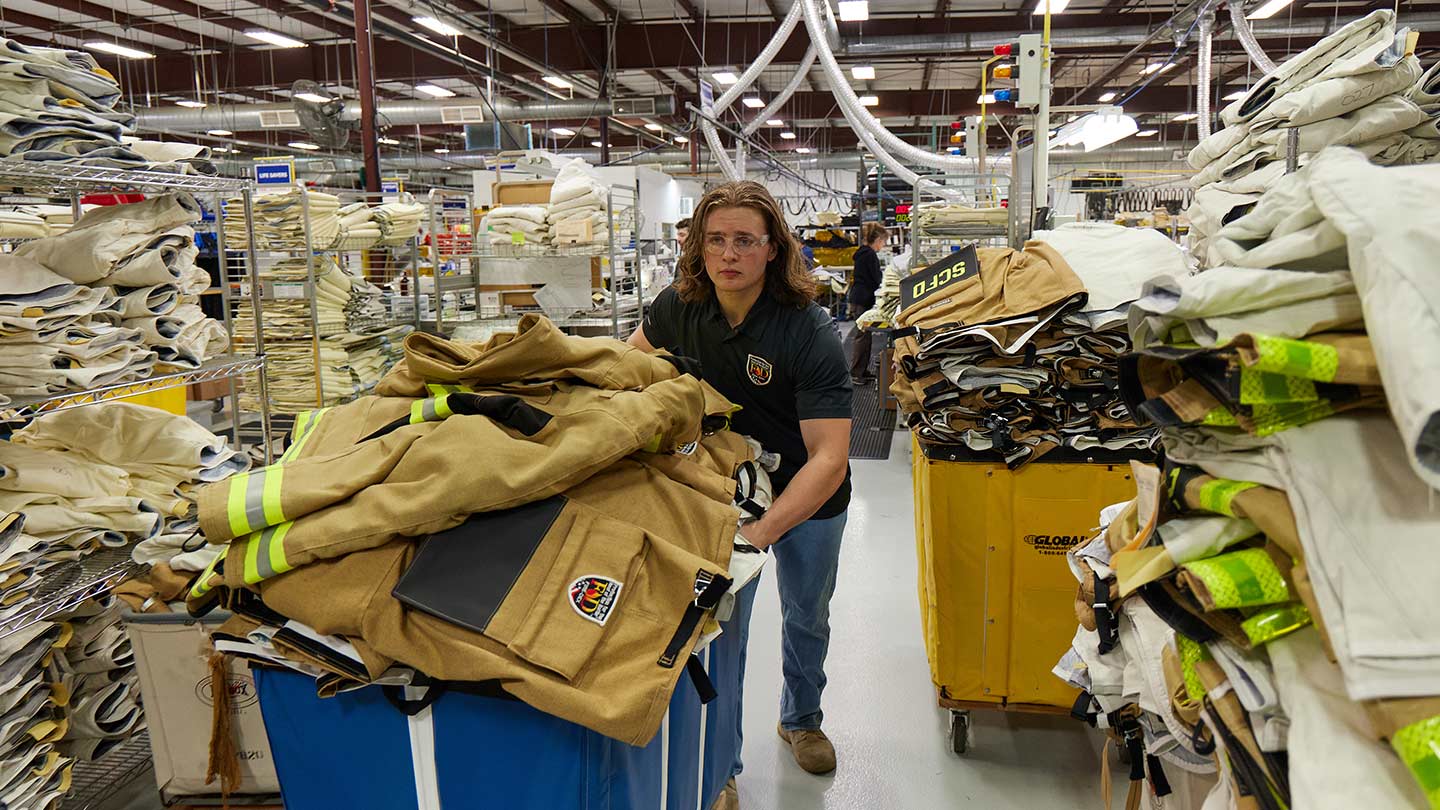
An Ohio-based company is protecting first responders around the world
With support from JPMorganChase, Fire-Dex is providing protective equipment to firefighters in 100 countries and all 50 states.
Learn moreLatest news

Veteran’s Unconventional Path to Landing her Dream Job in Tech
U.S. Army Veteran Ashley Wigfall transitioned to a civilian role and charted her path to technologist through mentorship and skills training at the JPMorgan Chase tech hub in Plano, Texas.
Learn more
The COVID-19 pandemic has caused unprecedented health and economic consequences and exacerbated existing inequalities—straining families’ economic mobility and restricting the U.S. economy. More than ever, decisionmakers need data-driven economic analysis with an inclusive lens. Over the last year, the JPMorgan Chase Institute continued to deliver groundbreaking research and expert findings on the financial health of US households and businesses aimed at helping policymakers, industry, and non-profit leaders make more informed decisions.
Below we have assembled 10 key charts that summarize 2021. Collectively they illustrate the financial impact of the pandemic on households, workers, and businesses, as well as the role of government supports in counteracting some of the economic consequences of the pandemic.
As we move into 2022, the Institute will continue to be laser focused on answering our toughest economic questions, and, alongside the JPMorgan Chase PolicyCenter, highlighting evidence-based solutions for policymakers and decision makers to create an inclusive recovery. Thank you for your continued partnership, interest, and engagement in our work. Together, we can use data and evidence to make more informed decisions that advance prosperity for all.
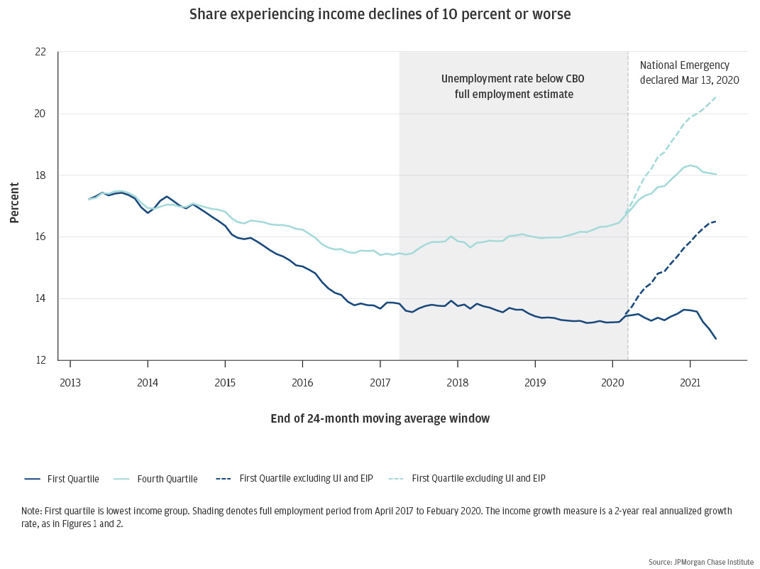
Figure 1: Targeted government supports successfully helped low-income families weather the pandemic
A key role of government is to mitigate downside income risk to families from business cycles. The extended period of economic expansion prior to COVID-19 yielded disproportionate gains to lower income families by reducing the share of families experiencing income declines of 10 percent or more. During COVID, the unprecedented fiscal supports were very effective in mitigating financial distress and maintaining income growth momentum, particularly for low-income households. When including expanded Unemployment Insurance and Economic Impact Payments, the share of low-income families who lost significant income actually fell modestly, instead of rising by considerably.
While the damaging effects of prior recessions have disproportionately landed on lower-income households and people of color, the large policy response to COVID-19 provided financial buoyancy that kept lower income families afloat.
These findings, along with other implications shown in the report, demonstrate the potential for both monetary and fiscal policy to influence the trajectory of income inequality.
Figure 2: With each round of stimulus, low-income families saw the greatest relative gains in cash balances but depleted those gains faster than high-income families
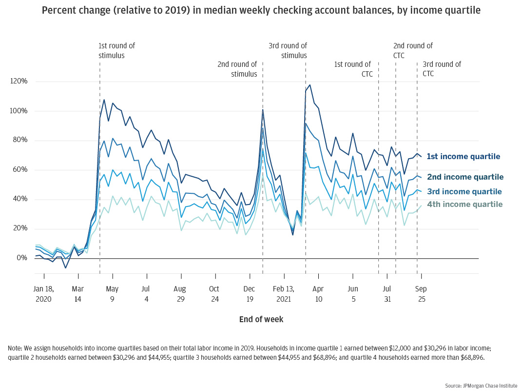
In response to the COVID-19 pandemic and accompanying recession’s impact on families’ financial positions, the federal government provided direct cash assistance to families through stimulus payments, unemployment insurance, and most recently, the advanced Child Tax Credit (CTC). Following each round of stimulus, families with lower incomes and assets experienced higher balances but also spent that money more quickly, most likely on necessary goods and services.
The speed of depletion demonstrates the comparative need for liquidity among low-income families, and points to the importance of targeted support by income levels when considering future emergency assistance.
As of the end of September 2021, household cash balances were still elevated by roughly 70 percent for low-income families and families receiving advanced CTC payments. For more information and future updates in 2022, check out our Households Cash Balance Pulse.
Figure 3: People of color had lower cash balances throughout the pandemic but experienced the largest relative boosts from government supports
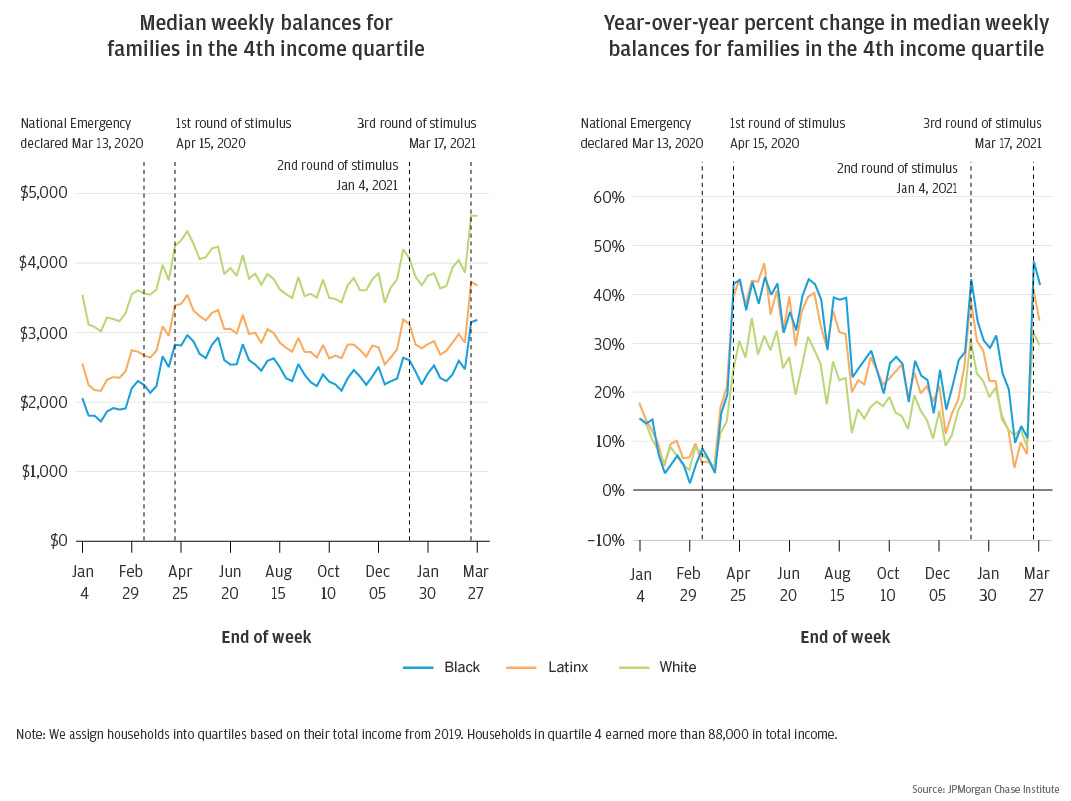
Previous JPMorgan Chase Institute research demonstrates racial gaps in financial outcomes. At the start of the pandemic, Black families had lower starting liquid balances than Latinx or White families and saw the smallest balance increases in dollar terms but the largest balance boosts in percentage terms during the pandemic. This trend holds even after accounting for income differences. Within each race group, women have lower account balances and depleted their balance gains more quickly than men.
This research underscores that pandemic-based financial need was not evenly distributed by race, and the relative cash boost from each round of stimulus was larger but more short-lived among lower-income Black and Latinx families. This signals the critical, but also temporary, nature of those government supports.
More insights on financial outcomes by race during COVID-19 are included in the full report.
Figure 4: Enhanced UI benefits had a small effect on recipients’ decision to return to work relative to other factors
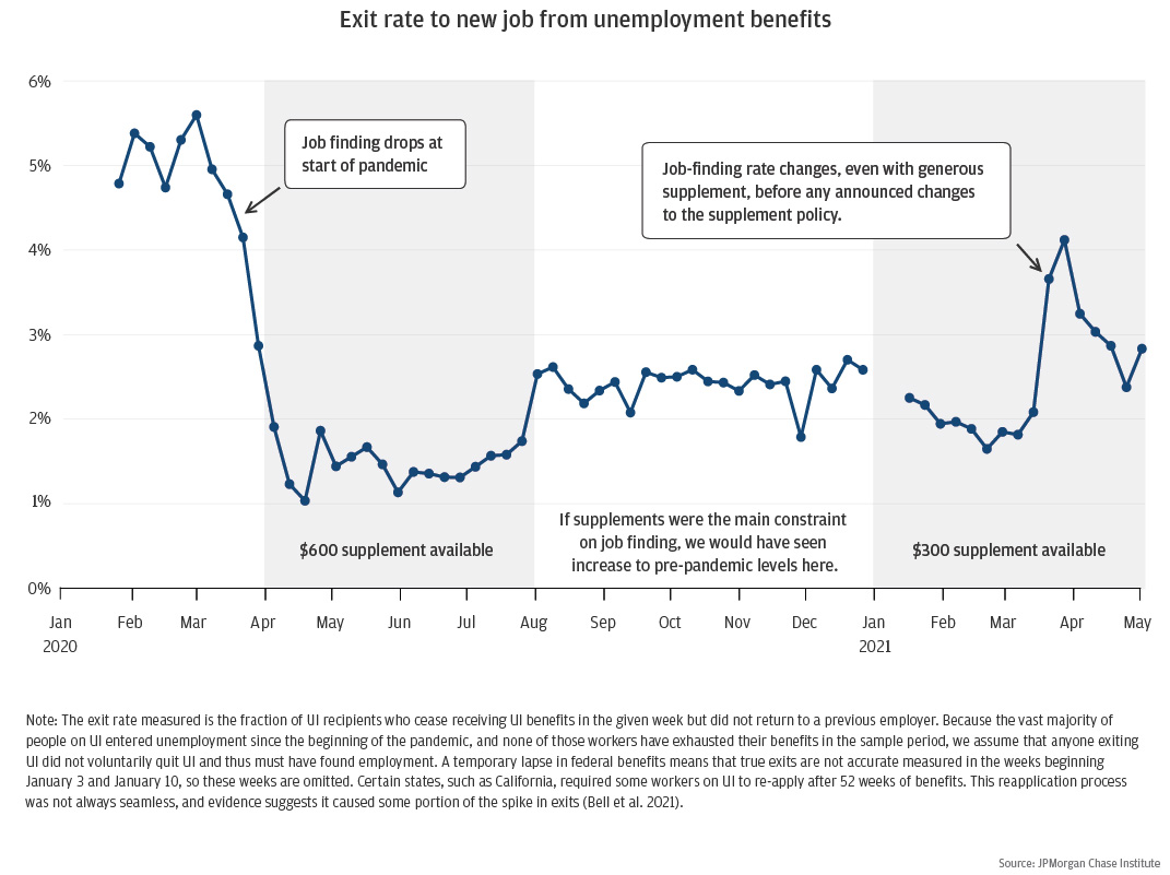
In response to the COVID-19 pandemic, Congress expanded unemployment insurance (UI) benefits through an increased level of benefits, expanded pool of workers eligible to receive UI via the Pandemic Unemployment Assistance (PUA) program, and extended the duration of benefits. As part of our ongoing research around UI benefits, the Institute studied the extent to which UI supplements might have discouraged jobless workers from returning to work.
Our research suggests that as of May 2021, UI supplements had an impact on job-finding of unemployed workers, but it was small and was not holding back the labor market recovery in a very significant way or contributing to wage growth that has occurred at the bottom of the income distribution. For a deeper dive into this and PUA targeting, read the research brief and companion academic paper.
Figure 5: Many more Online Platform Economy (OPE) workers received unemployment insurance than the general population
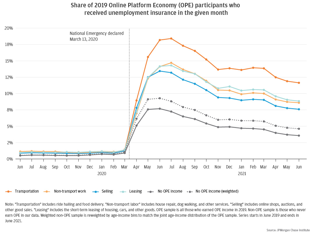
Just a decade ago, the Online Platform Economy comprised a handful of marketplaces connecting independent sellers to buyers of physical goods. Today, we rely on platforms to find transportation to the airport, someone to walk our dog, a place to stay on vacation, and gifts for our family members. With the expansion of unemployment insurance benefits to gig workers and other self-employed workers through the Pandemic Unemployment Assistance program, how much did platform participants rely on unemployment insurance during the pandemic?
Overall, Online Platform Economy workers appear to be particularly vulnerable to economic shocks with extremely high rates of UI receipt during the pandemic. Of all platform workers, drivers appear to be the group of biggest concern for policymakers. They are the most numerous group, have the lowest family incomes, and were the most likely to have received unemployment insurance during 2020. The continued rise of the Online Platform Economy raises the importance of strengthening the social safety net for contingent workers. For more insight into the online platform economy through the pandemic, read the full report here.
Figure 6: Rental property owners in New York and Miami were much more likely to miss mortgage payments
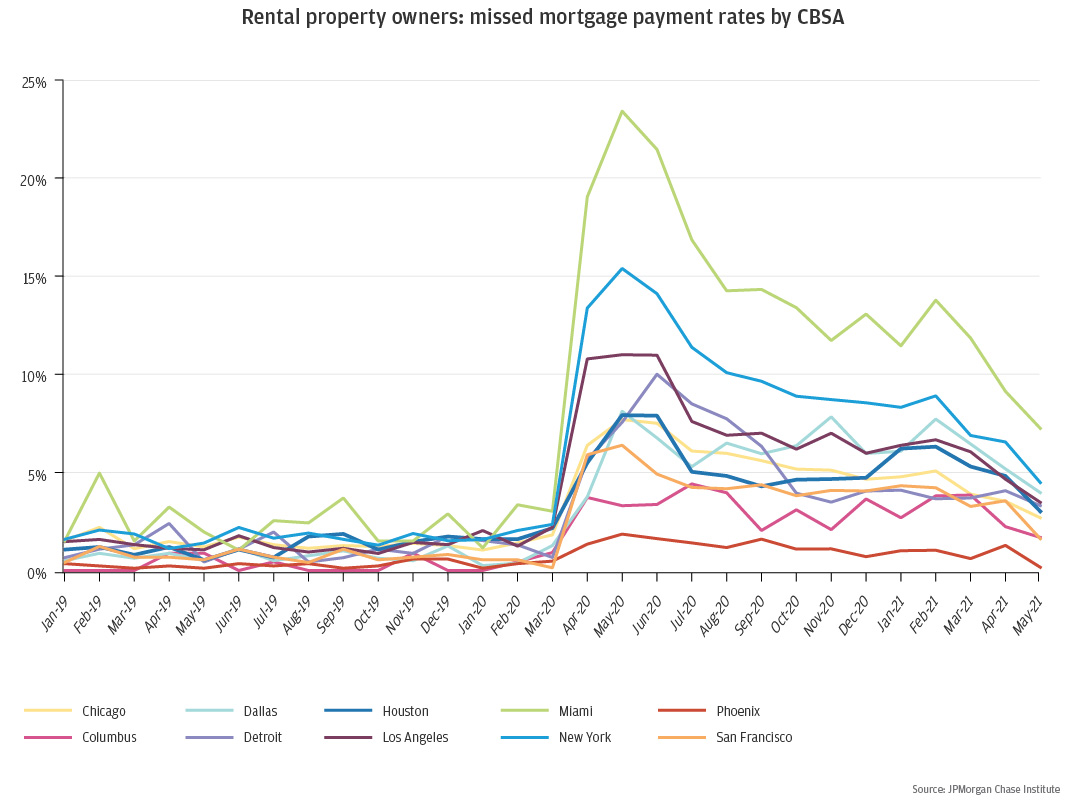
The COVID-19 pandemic hit renters harder than homeowners, leading policymakers to activate eviction moratoriums and appropriate billions of dollars of rental assistance. Given the critical role that landlords play in providing rental housing and their dependence on rental income, it is important to understand not just how the pandemic has affected tenants, but also the financial health of landlords.
Landlords in New York, Miami, and San Francisco—especially those in the core urban areas—experienced the largest rental income declines. Cities where rental income declined more were also the same cities where landlords were more likely to miss mortgage payments. For example, nearly one in four landlords in Miami and one in seven landlords in New York missed at least one mortgage payment on their rental property. The variability in geographic impact also suggests the need for different policy responses across different states and localities. For landlords experiencing substantial shortfalls of rental income, accelerating the pace of rental relief is critical for both making landlords whole and staving off eviction for tenants.
Click here to see how else landlords’ financial position varied across geography.
Figure 7: Student loan forgiveness, especially with no income targeting, does little to mitigate the racial wealth gap
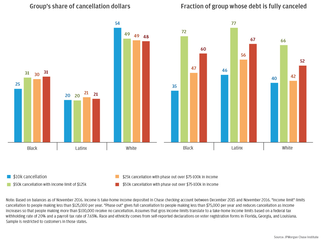
Even before the pandemic, many student loan borrowers faced payment burdens well over 10 percent of take-home income or debt traps, in which they cannot keep up with monthly interest rates. During COVID, the government paused payments and interest accumulation on federal student loans through January 31, 2022. On top of this payment relief, some policymakers have also proposed permanent forgiveness of federal student loans, which represent roughly 96 percent of total student loan debt. By using administrative banking and credit bureau data, the Institute assessed how different debt cancellation scenarios would be distributed by borrower race and ethnicity.
These findings show that student debt cancellation disproportionately benefits middle- and high-income and White families. Although income targeting makes cancellation less regressive and channels a larger share of the benefits to Black families, student loan forgiveness alone is unlikely to significantly affect the racial wealth gap.
To see how the benefits of the different cancellation plans would be distributed by household income and borrowers’ remaining time to pay off their debt, click here to read the rest of the report.
Figure 8: Small personal services firms and restaurants were significantly impacted by the pandemic
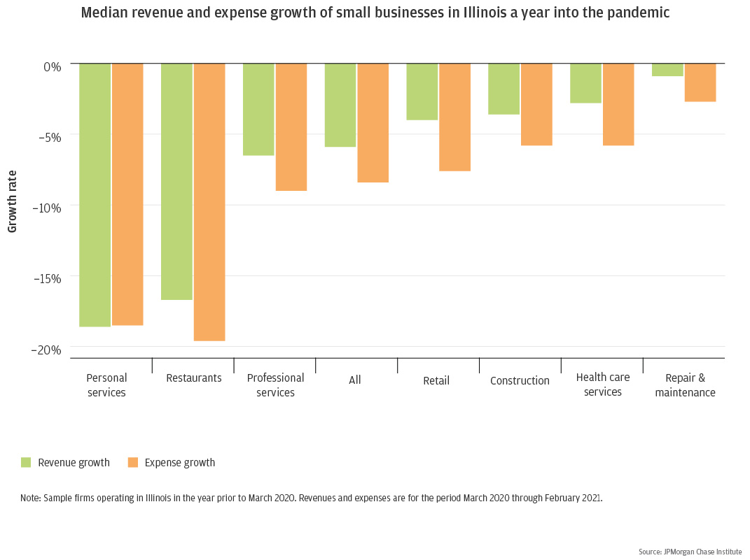
Small businesses continued to adapt over the course of the pandemic. While revenues have yet to fully recover, cash balances are elevated relative to pre-pandemic levels. Personal services firms and restaurants saw the greatest decreases in revenues. Notably, both industries are highly dependent on in-person interaction. The chart above also shows that expenses declined by a larger magnitude than revenues in most industries, which may have helped firms manage their cash flows. However, expenses declined by less than revenues among small personal services firms, adding to the challenges they may have faced.
As policymakers deliberate additional relief efforts, they might consider personal service firms and restaurants more explicitly to accommodate for their weaker financial positions. To learn more about the impact of the recession on small businesses, check out the full report.
Figure 9: Levels of small business owner liquid wealth increase modestly over the first four years
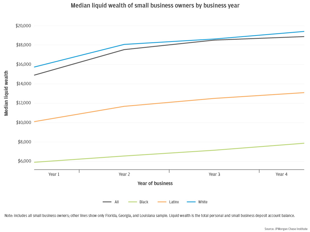
To estimate small business owner liquid wealth pre-pandemic, we measured the typical liquid wealth for all small business owners in each of the first four years of business. Liquid wealth of small business owners whose firms survive at least four years increases over time, albeit modestly.
If business ownership effectively closed wealth gaps, then one might expect to see some of the liquid wealth gap between the typical Black, Latinx, and White small business owner dissipate as the business matures. However, this chart shows there were substantial racial gaps in small business owner liquid wealth throughout the entire period, even among small businesses that survived at least four years.
The typical small business owner in year 4 has more liquid wealth than the typical small business owner in year 1, the magnitude of the difference is not suggestive of substantial wealth accumulation. Further, the liquid wealth increase of $2,000 for the typical Black small business owner between years 1 and 4 is less than the $3,700 increase for the typical White small business owner in these years. The $3,000 increase for the typical Latinx small business owner in year 4 compared to year 1 is slightly less than the typical White small business owner. Click here to read more.
Figure 10: Online spending peaked at the start of the pandemic and has remained high since
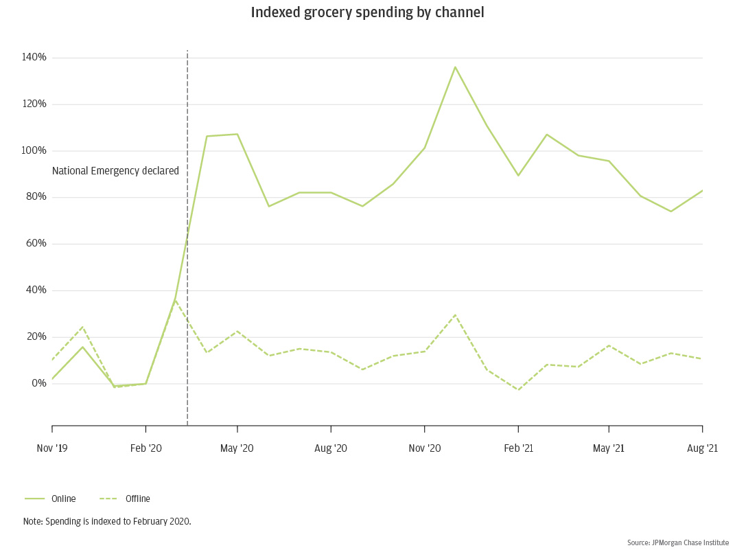
During the initial months of the COVID-19 pandemic, total online consumer spending increased by 43.7 percent year-over-year. This unprecedented increase resulted from the threat of infection and local restrictions that made it harder to shop in-person. Further contributing, many households maintained their incomes during the pandemic through a combination of savings, work-from-home, and stimulus payments. As illustrated above, online spending growth on groceries peaked at 136 percent above its February 2020 baseline and is 83 percent above baseline in August 2021.
As acute pandemic conditions ease, the persistence of new consumer online shopping habits is uncertain. If the increase in online retail is temporary, then short-term support for struggling brick-and-mortar businesses and city centers may be sufficient. However, if consumers maintain these new shopping habits, longer-term policies may be warranted to help cities adjust to a new equilibrium of where and how consumers shop. Click here to read more about the pandemic shock to online retail.
We thank Emily Rapp, Robert Caldwell, Anthony Rivera, and Stephen Harrington for their support. We are indebted to our internal partners and colleagues, who support delivery of our agenda in a myriad of ways, and acknowledge their contributions to each and all releases.
We would like to acknowledge Jamie Dimon, CEO of JPMorgan Chase & Co., for his vision and leadership in establishing the Institute and enabling the ongoing research agenda. We remain deeply grateful to Demetrios Marantis, Head of Corporate Responsibility, Heather Higginbottom, Head of Research & Policy, and others across the firm for the resources and support to pioneer a new approach to contribute to global economic analysis and insight.
This material is a product of JPMorgan Chase Institute and is provided to you solely for general information purposes. Unless otherwise specifically stated, any views or opinions expressed herein are solely those of the authors listed and may differ from the views and opinions expressed by J.P. Morgan Securities LLC (JPMS) Research Department or other departments or divisions of JPMorgan Chase & Co. or its affiliates. This material is not a product of the Research Department of JPMS. Information has been obtained from sources believed to be reliable, but JPMorgan Chase & Co. or its affiliates and/or subsidiaries (collectively J.P. Morgan) do not warrant its completeness or accuracy. Opinions and estimates constitute our judgment as of the date of this material and are subject to change without notice. The data relied on for this report are based on past transactions and may not be indicative of future results. The opinion herein should not be construed as an individual recommendation for any particular client and is not intended as recommendations of particular securities, financial instruments, or strategies for a particular client. This material does not constitute a solicitation or offer in any jurisdiction where such a solicitation is unlawful.
Authors

Chris Wheat
President, JPMorganChase Institute

Fiona Greig
Former Co-President