With a GDP of $501 billion, the San Francisco metropolitan area is the sixth largest economy in the U.S. and an important hub in the global economy.1 The median household income in San Francisco is $96,265 and there are 99,307 small, non-employer establishments.2 Moreover, the unemployment rate is more than a percentage point lower than the country as a whole and average hourly wages are $10 more than the national average.3 While the overall economy in San Francisco is strong, there is significant variation in household and small business financial outcomes.

 Infographic describes about households and small businesses financial outcomes
Research Theme Measurement Area
Online Platform Economy San Francisco Metropolitan Area
Local Commerce San Francisco Metropolitan Area
Small Business Figures 11-14: San Francisco City and County
Figures 15-16: San Francisco Metropolitan Area
Out-of-pocket Healthcare Spending San Francisco City and County

To better understand the financial lives of U.S. households and small businesses, the JPMorgan Chase Institute explored questions of economic relevance through the lens of de-identified transaction and account summary data from over 70 million consumers and 2.5 million small businesses. These data allowed us to provide localized insights on the San Francisco economy, including trends in out-of-pocket healthcare spending, Online Platform Economy participation and revenues, local commerce, and small business financial outcomes. Our local commerce and Online Platform Economy data allow us to observe trends at the San Francisco metropolitan area level, whereas our small business data are aligned to San Francisco city limits, and our healthcare research observes trends at the county level.

Online Platform Economy

Drivers and Lessors in San Francisco See Above Average Revenues

American households experience significant income and expense volatility. The Online Platform Economy has created a new marketplace for work by providing flexible, highly accessible opportunities to generate earnings that have the potential to help individuals buffer against income and expense shocks. JPMorgan Chase Institute research has divided the Online Platform Economy into four key sectors: transportation, leasing, selling, and non-transport work. In the JPMorgan Chase Institute report, The Online Platform Economy in 27 Metro Areas: The Experience of Drivers and Lessors, we leveraged de-identified data from 2.3 million families participating in the Online Platform Economy to track supply-side participation, revenues, and engagement rates in two sectors—transportation and leasing—across 27 metro areas.

We observed strong secular national trends in two of the sectors, transportation and leasing, starting in 2013. Nationwide, transportation sector participation—measured as the fraction of our sample generating income through a transportation platform in any given month—increased by more than a factor of 20 from 2013 to 2018, while average monthly revenues declined by half. On the leasing side, we found that participation rates tripled nationwide while average monthly revenues doubled.

These national trends tell a story that is consistent across many metro areas. In the transportation sector, average revenues fell by 40 percent or more in 15 metro areas and did not increase in any metro area, whereas participation rates increased in every area we tracked. In San Francisco, transportation sector participation increased from 0.17 percent in the first ten months of 2013 to 1.85 percent in the first ten months of 2018, and average driver revenues decreased by 27 percent from $1,696 in the first ten months of 2013 to $1,231 in the first ten months of 2018. In seven cities, there were too few participants in 2013 to present the area average, and so those are rolled into the residual group which we label “Everywhere Else.”

Figure 1: Change in average monthly revenues and participation, transportation sector

Bar graph describes about change in average monthly revenues and participation, transportation sector, San Francisco, transportation sector participation increased from 0.17 percent in the first ten months of 2013 to 1.85 percent in the first ten months of 2018

Figure 1

Bar charts showing the change in average monthly revenues for each sector across 21 metro areas in 2013 and 2018. In almost every area, average monthly revenue declined for drivers and rose for lessors between 2013 and 2018.

Source: JPMorgan Chase Institute

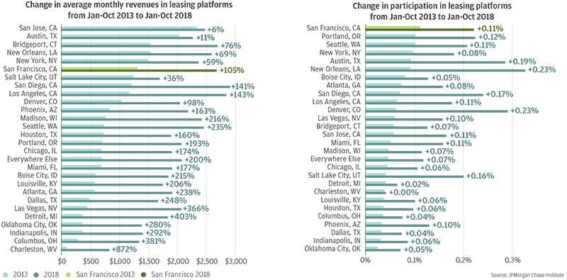
On leasing platforms, participation rates increased in every area, while average monthly lessor revenues doubled or more in 21 areas and increased in all 28. In San Francisco, leasing participation doubled from 0.11 percent in the first ten months of 2013, to 0.22 percent in the first ten months of 2018.

Figure 2: Change in average monthly revenues and participation, leasing sector

Bar graph describes about change in average monthly revenues and participation, leasing, sector San Francisco, leasing participation doubled from 0.11 percent in the first ten months of 2013, to 0.22 percent in the first ten months of 2018

Figure 2

Bar charts showing the change in average monthly revenues in leasing platforms from Jan-Oct 2013 to Jan-Oct 2018 across 28 metro areas. Bar charts showing the change in participation in transportation and leasing platforms from Jan-Oct 2013 to Jan-Oct 2018. Lessor participation rates increased in every area between 2013 and 2018, but some areas grew more than others. For the leasing sector, participation rates grew the most in New Orleans (+0.23%) and Austin (+0.19%).

Source: JPMorgan Chase Institute

Along with these strong secular trends, we found that there is significant variation across cities at any point in time. Specifically, we looked at differences in participation rates, average monthly revenues, and engagement rates in October 2018. We defined engagement as the fraction of October 2018 participants who also earned platform income in eight or more months over the previous year. We focused on the month of October because it typically does not display a seasonal peak or trough in terms of income or spending. In the transportation and leasing sectors, we found that participation and revenues were positively correlated, but there were telling exceptions to that pattern.

In the transportation sector, San Francisco had the highest driver participation—just under two percent—and had the highest revenues of any metro area ($1,508 per driver in October 2018). We found that patterns in engagement reflect patterns in revenues; San Francisco had one of highest engagement rates at approximately 15 percent.

Figure 3: Transportation sector participation, average revenue, and engagement varied widely across metro areas

Bar graph shows transportation sector participation, average revenue, and engagement varied widely across metro areas, San Francisco had one of highest engagement rates at approximately 15 percent

Figure 3

Bar charts showing the fraction of sample generating income from transportation platforms in October 2018, Average monthly revenue for active drivers in October 2018, and Percent of drivers active for 9 months or more in the 12 months up to October 2018. All three, participation, revenue, and engagement, varied widely across metro areas. While San Francisco topped the list for participation and revenue, it did not in engagement. The most engaged drivers were in New York City and Dallas. Charleston, West Virginia was at the bottom of the list for sector participation, average revenue, and engagement, along with Louisville.

Source: JPMorgan Chase Institute

Participation on leasing platforms is limited, but there is still significant variation across areas in terms of average monthly lessor revenues and engagement rates. In October 2018, San Francisco had comparatively high average monthly lessor revenues ($2,812 per lessor), moderately high participation (0.21 percent), and high engagement (about 17 percent).

Figure 4: Leasing sector participation, average revenue, and engagement varied widely across metro areas

Bar graph shows leasing sector participation, average revenue, and engagement varied widely across metro areas, San Francisco’s average driver and lessor revenues stood out for being significantly higher than other cities with similar participation rates in October 2018

Figure 4

Bar charts showing fraction of sample generating income from leasing platforms in October 2018, Average monthly revenues among active lessors in October 2018, and Percent of lessors active for 9 months or more in the 12 months up to October 2018. There is wide variation across metro areas in terms of sector participation, average monthly revenues, and engagement. Participation rates were the highest in New Orleans, where 0.34 percent of sample families generated income on leasing platforms in October 201. The lowest were in Detroit and Oklahoma City. Average monthly revenues generated were over $1,000 in all cities, but vary widely. New Orleans is again high at $2,929. In regards to engagement, More than 20 percent of participants were highly engaged in New Orleans and Portland. In other cities, such as Detroit and Oklahoma City, the fraction was less than eight percent.

Source: JPMorgan Chase Institute

Interestingly, San Francisco’s average driver and lessor revenues stood out for being significantly higher than other cities with similar participation rates in October 2018. Several supply- and demand-side factors are likely to play a role in explaining why particular cities stand out from the overall pattern, including regulation, vehicle ownership, hotel occupancy rates, and metro area density.

We found that metropolitan areas with larger incumbent industries as the Online Platform Economy emerged had higher participation and higher average revenues in the corresponding platform sectors. The measure of incumbent industries provides an indicator of the potential market size for new transportation and leasing service providers, thereby pointing at the demand side of the Online Platform Economy. Additionally, every local characteristic we explored that was associated with higher levels of participation was also associated with higher average monthly revenues. This suggests that rising participation does not directly cause falling average revenues, which are two coincident trends we observed in prior research.

Local Commerce

Younger and Lower Income Consumers Contribute the Most to Spending Growth in San Francisco

Consumer spending makes up more than two thirds of GDP.4 The JPMorgan Chase Institute’s Local Commerce research provides insights into the decisions made by consumers and businesses as measured by everyday debit and credit card purchases. By leveraging our Local Commerce (LC) lens, we provide a granular, transaction-level view into the demographic and firmographic drivers of spending growth in 14 U.S. cities. Moreover, we use customer and merchant location to understand the distance at which a purchase was made. With respect to spending growth, we generate two complementary views:

  • The merchant view, which we feature in our Local Commerce Index consists of credit and debit card spending by over 64 million Chase customers at merchants located across 14 U.S. metro areas.
  • The consumer view, which we first explored in our report Shopping, Near and Far: Local Commerce in the Digital Age, consists of four billion credit and debit card transactions made by 7.7 million consumers residing within 14 U.S. metro areas.

We leverage the merchant and consumer views of local spending to observe year-over-year growth in San Francisco, as well as demographic trends.

Box 1: Inclusion criteria for Local Commerce

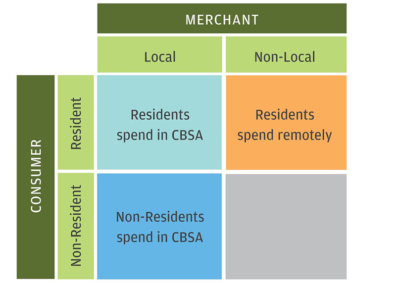
The Local Commerce Lens is framed along customer location, merchant location, and transaction channel. These dimensions lead to six different groups of transactions. The customer and merchant location determine the spatial distance at which the transaction occurred, while the online/offline channel determines to what extent the distance between the consumer and merchant matters.

Infographic describes about Inclusion criteria for Local Commerce

Box 1: Inclusion criteria for Local Commerce


  Local Merchant Non-Local Merchant
Resident Consumer Residents spend in CBSA Residents spend remotely
Non-Resident Consumer Non-Residents spend in CBSA  

Source: JPMorgan Chase Institute

Year-Over-Year Growth

Comparing the topline year-over-year (YOY) growth rates in spending across the consumer and merchant lenses reveals that, in every month, spending by San Francisco residents grew faster than spending at San Francisco establishments. As noted in Box 1, spending by residents includes residents’ spending at establishments in other locations, while spending at San Francisco establishments includes purchases from residents of other localities. Insofar as spending by residents (consumer view) is increasing faster than spending at establishments (merchant view), the gap in growth rates highlights the role of remote purchasing (e.g. online commerce) as a large and growing component of San Francisco residents’ everyday spending behaviors, especially in comparison to locally-based spending.

While the overall growth figures provide a high-level view of the vibrancy and overall health of the San Francisco economy, disaggregating this growth by customer and establishment characteristics provides crucial context and detail on which groups of people and businesses are contributing to overall growth. Figures 6-10 examine growth in San Francisco by characteristics presented in the merchant view of everyday spending found in the Local Commerce Index.

Figure 5: Year-over-year growth is consistently higher in the consumer view

Line graph shows year-over-year growth is consistently higher in the consumer view

Figure 5

Line graph showing year-over-year spending growth for San Francisco both for the merchant view and the consumer view of the Local Commerce Index. In every month, spending by San Francisco residents grew faster than spending at San Francisco establishments. The gap in growth rates highlights the role of remote purchasing, such as online commerce, as a large and growing component of San Francisco resident’s everyday spending behaviors.

Source: JPMorgan Chase Institute

Demographic Characteristics—Age and Income

In San Francisco, younger consumers under the age of 35 tended to contribute more to growth compared to their older counterparts. Over the course of the series, consumers under 35 contributed an unweighted average of 1.5 percentage points to an unweighted average topline growth number of 1.5 percent.

Throughout the lifespan of the series, consumers under the age of 35 have never subtracted from spending growth in San Francisco. This highlights the important role that younger consumers have in driving spending growth at local merchants.

Figure 6: Consumers under 35 consistently contribute to growth

Bar graph shows how consumers under 35 consistently contribute to growth

Figure 6

Stacked bar chart showing growth contributions by age between 2015 and 2018. Individuals aged 25 to 34 and 35 to 44 consistently drove online spending growth, contributing on average 2.6 percentage points to growth in each month. The smallest contributions came from consumers over the age of 65, though their contributions have increased over time. Consumers under the age of 35 have never subtracted from spending growth in San Francisco.

Source: JPMorgan Chase Institute

Figure 7: Lower income consumers consistently contribute to growth

Bar graph describes about lower income consumers consistently contribute to growth

Figure 7

Analogous to Figure 6, this stacked bar chart shows growth contributions by income between 2015 and 2018. Similar to age, consumers on the lower end of the income spectrum tend to contribute most and most consistently to growth. Consumers in the first two income quintiles contributed an unweighted average of 1.4 percentage points. Consumers in the first income quintile have contributed the most to spending growth at San Francisco merchants 50 out of the 60 months observed.

Source: JPMorgan Chase Institute

© 2019 JPMorgan Chase & Co.

Similar to age, consumers on the lower end of the income spectrum tend to contribute the most and most consistently to growth. In fact, consumers in the first two income quintiles combined have never subtracted from growth. Over the course of the series, consumers in the first two income quintiles contributed an unweighted average of 1.4 percentage points to an unweighted average topline growth number of 1.5 percent.

In particular, consumers in the first income quintile have contributed the most to spending growth at San Francisco merchants 50 out of the 60 months we observe in our series, the most number of times of any income quintile.

Spatial Characteristics—Location of Consumer Relative to Merchant

In the Local Commerce Index, spending by residents that live in the same Public Use Microdata Area as the establishment is considered “Same Neighborhood” spending. Relatedly, spending from other San Francisco residents and spending from consumers that live outside of San Francisco are considered “Same Region” and “Different Region” spending, respectively. The location of the consumer relative to the merchant gives a sense of the extent to which the growth (or decline) in spending remains in the community.

In San Francisco, we observe that contributions to spending growth mostly come from transactions in which the consumer was from a different region than the merchant. Over the course of the series, spending by those consumers from a different region than the merchant contributed an unweighted average of 1.2 percentage points to an unweighted average topline growth number of 1.5 percent.

Figure 8: Growth contributions are highest for non-local spending

Bar graph shows that growth contributions are highest for non-local spending

Figure 8

Stacked bar chart showing growth contributions for local versus non-local spending. In San Francisco, contributions to spending growth mostly come from transactions in which the consumer was from a different region than the merchants. Spending by those consumers contributed an unweighted average of 1.2 percentage points to an unweighted average topline growth number of 1.5 percentage points.

Source: JPMorgan Chase Institute

Firmographic Characteristics—Product Type and Business Size

In San Francisco, spending at providers of other services (e.g. medical providers, accountants, professional services) tended to contribute the most to growth. Over the course of the series, spending at other services providers contributed an unweighted average of 1.1 percentage points to an unweighted average topline growth number of 1.5 percent.

Following other services providers, substantial contributions to growth were made by spending at restaurants and non-durables (e.g. groceries, clothing) providers, each contributing an unweighted average of 0.7 and 0.4 percentage points to overall growth over the course of the series, respectively.

Figure 9: Spending on other services tends to contribute the most to growth

Bar graph showing spending on other services tends to contribute the most to growth

Figure 9

Stacked bar chart showing spending on categories of goods, including durables, fuel, nondurables, other services, and restaurants. In San Francisco, spending at providers of other services (which may include medical providers, accountants, and professional services) tended to contribute most to spending growth: an unweighted average of 1.1 percentage points. Spending at restaurants and non-durables closely followed other services in growth contribution.

Source: JPMorgan Chase Institute

Looking at firm size, the spending growth contributions by small businesses play an important role in overall growth in San Francisco. Although medium-sized businesses contributed the most to growth the most number of times over the course of our series, it was small businesses that had the largest unweighted overall average growth contribution of 0.7 percentage points.

Spending at small businesses contributed an unweighted average of 0.7 percentage points to an unweighted average topline growth number of 1.5 percent over the course of the series. Spending at small businesses has been a nearly consistent contributor to overall growth, subtracting from overall growth only eight months in total.

Figure 10: Small businesses contributed the most to growth over the series

Bar graph shows how small businesses contributed the most to growth over the series

Figure 10

Stacked bar chart showing growth contributions by merchant size. Spending growth contributions by small businesses play an important role in overall growth in San Francisco. Although medium-sized businesses also contributed to growth, small businesses had the largest unweighted overall average growth contribution at 0.7 percentage points.

Source: JPMorgan Chase Institute

Small Business

Small Businesses in San Francisco Have the Highest Revenue Growth

Small businesses are a pillar of urban economies, making substantial contributions to economic growth and dynamism. In the JPMorgan Chase Institute report, The Small Business Sector in Urban America: Growth and Vitality in 25 Cities, we analyzed differences in financial outcomes in the small business sector across some of the largest cities in the U.S., providing a lens into the composition and contributions of different types of firms to the aggregate revenue growth and exit rates of the small business sector. Our research leveraged deposit data from 290,000 small businesses that bank with Chase and suggested that small businesses in San Francisco are generally thriving.

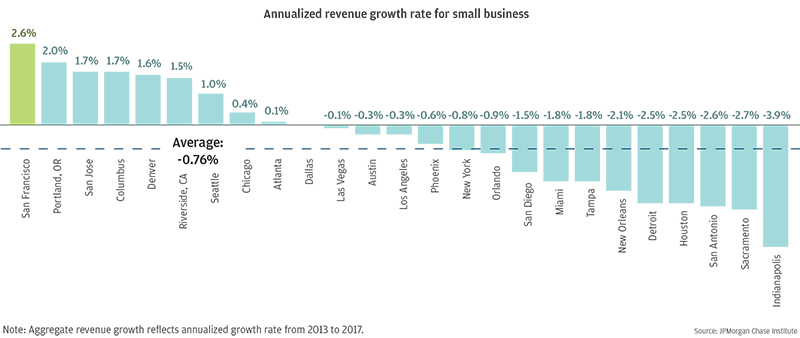
Consistent revenue streams are critical for small businesses, fueling their ability to not only survive, but potentially grow. We found that the small business sector in San Francisco had the highest level of revenue growth compared to 24 other major U.S. cities, as the aggregate revenue of small businesses operating in San Francisco grew 2.6 percent annually over a period of four years.

Figure 11: Annualized revenue growth rate for small businesses varies across cities

Bar graph shows annualized revenue growth rate for small businesses varies across cities

Figure 11

Bar chart showing annualized revenue growth rate for small businesses across all 25 cities. The national average annualized revenue growth rate is -0.76%, but the growth rate varies widely by city. San Francisco tops the list with a 2.6% annualized revenue growth rate, while Indianapolis is at the bottom with a growth rate of -3.9%.

Source: JPMorgan Chase Institute

While the region’s reputation as a technology hub, relative to other cities we observed, still holds somewhat true for small businesses, small construction firms actually contributed the most to aggregate small business revenue growth in San Francisco, with small high-tech services firms second. Revenue growth contributions are net positive for restaurants (0.14 percentage points) and other professional services (0.43 percentage points), both of which had relatively high and sustained contributions to spending growth in our Local Commerce analysis.

Figure 12: Contribution to growth rate, by industry in San Francisco

Graph shows contribution to growth rate, by industry in San Francisco

Figure 12

Waterfall chart showing growth contributions by industry in San Francisco. Though the region holds a reputation as a technology hub, small construction firms actually contributed the most to aggregate small business revenue growth in San Francisco, with small high-tech services firms coming in with the second-highest growth contributions.

Source: JPMorgan Chase Institute

Moreover, our analysis showed that San Francisco was one of the few cities where both new firms (<1 year old) and young firms (1-10 years old) made positive contributions to growth. This suggests that vibrancy in the small business sector in San Francisco is not concentrated only among new firms but rather sustained across firms of all ages. However, new firms grew the fastest in San Francisco. New firms grew 9.8 percent annually, with most of this growth concentrated in the top five percent of firms as defined by their total dollar value change in revenue from 2013 to 2017.

Figure 13: Contribution to revenue growth by firm age

Bar graph shows contributions to aggregate revenue growth by firm age for each city, panel sample

Figure 13

Waterfall and bar chart showing growth contributions for firms by firm age and by city across 25 cities. Growth contributions by age segment vary substantially across cities. Where the small business sector is growing the fastest, such as Columbus, San Francisco, and Denver, both new and young firms made positive contributions to aggregate revenue growth. However, in most cities, both young and mature firms made small positive or large negative contributions to growth. New firms made the highest positive contributions to growth, growing the fastest at 9.8 percent annually—though both young and mature firms also had positive contributions to growth.

Source: JPMorgan Chase Institute

In the JPMorgan Chase Institute report Growth, Vitality, and Cash Flows: High-Frequency Evidence from 1 Million Small Businesses, we proposed a segmentation of small firms based on size, complexity and dynamism as a way to identify the contributions of different small business segments to the U.S. economy. In San Francisco, we found that organic growth firms, which are characterized by their intent to grow out of operating profits rather than the use of external financing, experienced the largest revenue growth. Moreover, within the top five percent of new firms, over 70 percent were organic growth firms. In contrast, stable micro firms, which are characterized by having no or very few employees, actually saw revenue declines. Additionally, while the share of financed growth firms is only three percent across the entire sample, some metro areas had a much higher concentration of these firms than others. More than four percent of all small firms in the San Jose and San Francisco metro areas were in the financed growth segment.

Figure 14: Contribution to growth, by segment

Bar graph shows contributions to aggregate revenue growth, by segment in San Francisco

Figure 14

Bar chart showing contributions to aggregate revenue growth by firm segment. In San Francisco, organic growth firms experienced the largest revenue growth while stable micro firms saw revenues decline.

Source: JPMorgan Chase Institute

In our recent report, Gender, Age, and Small Business Financial Outcomes, we observed small business financial performance, with a specific emphasis on differences in outcomes by owner age and gender. Overall, female-owned firms generated median first-year revenues that were about 34 percent lower than median revenues of male-owned firms. Firms founded by women were smaller than firms founded by men in every metropolitan area, though the size differential varied by location. In San Francisco, female-owned firms had $62K first year revenues whereas male-owned firms generated $94K their first year.

Figure 15: Median first-year revenues for female- and male-owned firms, by metro area

Bar graph shows median first year revenues for female and male owned firms, by metro area

Figure 15

Bar chart showing median first-year revenues for female- and male-owned firms by metro area. Female-owned firms generated median first-year revenues that were about 34 percent lower than median revenues of male-owned firms and female-owned firms are smaller than male-owned firms in every metropolitan area. However, the size differential varies by location. Firm founded by women in San Antonio and Austin were less than half the size of those founded by men, but female-owned firms in Miami typically had revenues that were 17 percent lower than male owned firms in the first year.

Source: JPMorgan Chase Institute

Additionally, we observed that young business owners under the age of 35 typically started smaller firms. In San Francisco, small business under 35 generated $78K in first-year revenues, whereas owners 35-54 generated $107K and owners 55 and over generated $105K.

Figure 16: Median first-year revenues, by age group and metro area

Bar graph shows median first year revenues by age group and metro area

Figure 16

Bar chart showing median first-year revenues by age group and metropolitan area. Young business owners under age 35 typically started smaller firms, though not in every city. In Indianapolis, for example, businesses with younger owners were 10 percent larger than businesses with prime-age owners – but smaller than those with owners at least 55 years old.

Source: JPMorgan Chase Institute

Out-of-Pocket Healthcare Spending

San Francisco Second Highest for Healthcare Spending Among California Counties

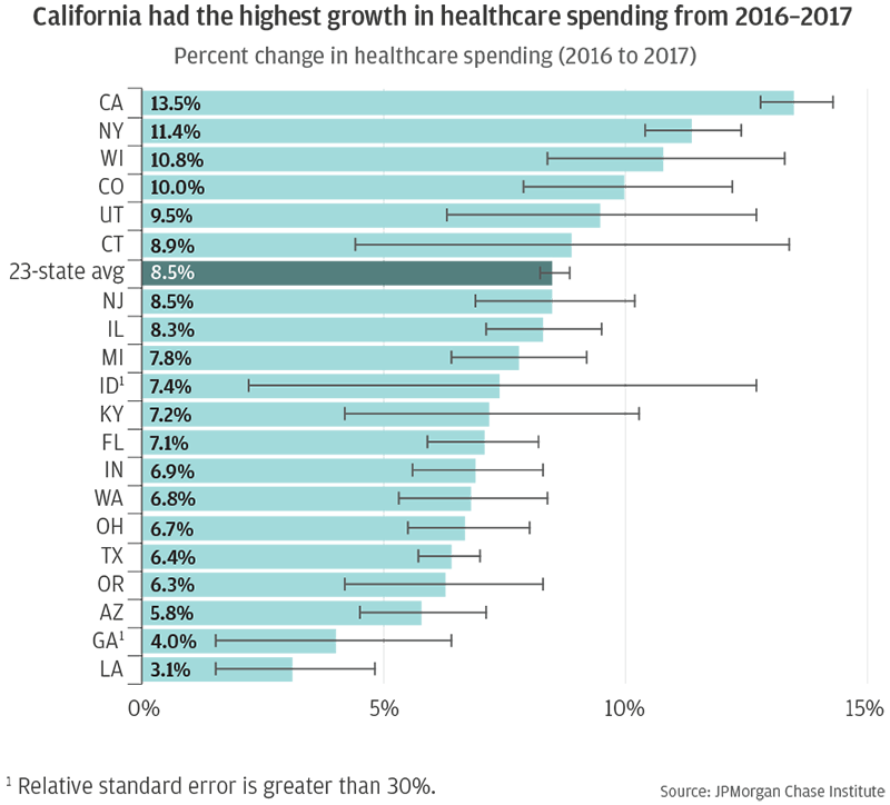
Healthcare spending is linked to families’ cash flows, and these dynamics affect not just when people pay for healthcare but also when they consume it. In the JPMorgan Chase Institute report, On the Rise: Out-of-Pocket Healthcare Spending in 2017, we explored families' out-of-pocket healthcare expenditures and the financial burden they imposed on families over time. Of the 23 states we tracked, California showed the fastest growth in spending levels from 2016 to 2017. The high healthcare spending growth in California in 2017 holds true across different demographics groups, indicating that all sub-populations experienced roughly comparable increases in out-of-pocket healthcare expenditures.

Figure 17: From 2016 to 2017, out-of-pocket healthcare spending grew the most in California

Bar graph shows that from 2016 to 2017 out-of-pocket healthcare spending grew the most in California.

Figure 17

Bar chart representing the percent change in healthcare spending from 2016 to 2017. California had the highest percent change in healthcare spending of 13.5 percent. The state with the lowest percent change in healthcare spending was Louisiana where the change was only 3.1 percent. The states in the sample fell within these ranges in no geographical pattern.

Source: JPMorgan Chase Institute

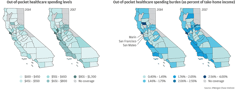
Top-spending counties in California tended to be high-income and located along the coast, especially in the Bay Area. The top three counties in terms of spending levels were Marin, San Francisco, and San Mateo, where the average annual growth rates exceeded ten percent from 2014 to 2017. In fact, there were a total of 13 counties in California that had average annual growth exceeding ten percent during this time period. High-income groups generally tended to spend more on healthcare. These coastal areas in California have high income and high costs of living, which may translate to high county averages in healthcare spending, leading to the geographic gradient we observed in county-level maps. However, it is noteworthy that the growth in these high-income counties exceeded the growth in spending across the 23 states we observed even among the high-income group. This underscores that these coastal regions in California, including San Francisco, have experienced considerable growth in healthcare spending during the last few years and especially in 2017.

Figure 18: California saw high growth in out-of-pocket healthcare spending in 2017, especially in coastal areas

Infographic shows how California saw high growth in out-of-pocket healthcare spending in 2017 especially in coastal areas.

Figure 18

Choropleth of California showing healthcare spending level and spending burden in 2014 and 2017. California saw the highest growth in healthcare spending in 2017, especially in coastal areas, such as San Mateo and Marin County – with spending levels between $801 and $1,300 a year, much larger than the California state average of $582. These counties also experienced a higher spending burden.

Source: JPMorgan Chase Institute

Figure 19: California saw high growth in out-of-pocket healthcare spending in 2017, especially in coastal areas

Graph shows how California saw high growth in out-of-pocket healthcare spending in 2017 especially in coastal areas.

Figure 19

Line chart showing the average out-of-pocket healthcare spending in top 3 counties in California. The overall trend of this chart shows that all three counties in this sample maintained very similar patterns in healthcare spending from 2014 to 2017, though some counties experienced higher spend levels than others. Healthcare spending levels increased very slightly from 2014 to 2016, but then increased more drastically from 2016 to 2017. In 2017, the average out-of-pocket healthcare spending was $1,152 in Marin, CA, &916 in San Francisco, CA, and $835 in San Mateo, CA. For the state of California, the average out-of-pocket healthcare spending was $582.

Source: JPMorgan Chase Institute

Conclusion

These insights provide a multi-faceted view of the financial health of San Francisco residents and small businesses.

Our geographically granular view of household spending can measure economic vibrancy and highlight local fiscal dynamics. Local leaders can use these data to better understand the economic activity of their jurisdiction, as well as how the locus of economic activity is changing over time. Additionally, our data provide a lens into small business aggregate revenue growth and exit rates—two key dimensions that characterize the economic health of the small business sector across cities. To the extent that there are specific and transferrable small business programs or policies that enable growth without impairing survival in cities, San Francisco could serve as a useful model given its relatively high small business revenue growth rates compared to exit rates.

References

1.

U.S. Bureau of Economic Analysis, 2017.

2.

U.S. Census Bureau, 2017.

3.

Bureau of Labor and Statistics, San Francisco Economic Summary, March 2019.

4.

Bureau of Economic Analysis, National Income and Product Accounts.

Acknowledgements

We thank Bryan Kim, Tanya Sonthalia, and Chex Yu for their research assistance and thoughtful contributions to this work.

This effort would not have been possible without the diligent and ongoing support of our partners from the JPMorgan Chase Consumer and Community Bank and Corporate Technology teams of data experts, including, but not limited to, Howard Allen, Samuel Assefa, Connie Chen, Anoop Deshpande, Andrew Goldberg, Senthilkumar Gurusamy, Derek Jean-Baptiste, Joshua Lockhart, Ram Mohanraj, Ashwin Sangtani, Stella Ng, Subhankar Sarkar, and Melissa Goldman, as well as JPMorgan Chase Institute team members, including Elizabeth Ellis, Alyssa Flaschner, Courtney Hacker, Sarah Kuehl, Caitlin Legacki, Sruthi Rao, Carla Ricks, Tremayne Smith, Gena Stern, Maggie Tarasovitch, Preeti Vaidya, Marvin Ward, and Chris Wheat.

Finally, we would like to acknowledge Jamie Dimon, CEO of JPMorgan Chase & Co., for his vision and leadership in establishing the Institute and enabling the ongoing research agenda. Along with support from across the firm—notably from Peter Scher, Max Neukirchen, Joyce Chang, Patrik Ringstroem, Lori Beer, and Judy Miller—the Institute has had the resources and support to pioneer a new approach to contribute to global economic analysis and insight