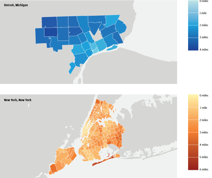
Figure 1: Merchant distances varied significantly by zip code in 2016
Findings
In recent years, local decision makers1 have become increasingly concerned with questions of resident access to amenities. How far are city residents traveling to make purchases? How should local policymakers judge whether or not their constituents have access to the things they need in their everyday lives? Which retail providers are best able to supply the goods and services residents want or need at prices they can afford? Resident access, in the current policy debate, simply means that amenities are close enough for residents to reach at a reasonable cost. However, this view is incomplete to the extent that some merchants may simply not provide the goods and services that residents want or need at an appropriate cost, thereby prompting residents to seek out more suitable options. Therefore, the relevant distance for local decision makers is the distance between residents and the locations at which they actually make purchases.
The time spent by residents while traveling to a merchant is a cost that increases with the distance between the resident and the merchant. Since residential choices about where to live depend on what the resident can afford, these costs have the potential to differ across the income spectrum. One response by local officials to unequal resident access to retail (and amenities in general) across income and other margins has been the advent of 20-minute neighborhoods.2 A 20-minute neighborhood is one in which a predetermined set of amenities can be reached within a 20-minute walk or bike ride. While this tactic is useful, it is not enough to know whether or not residents need to travel outside of their neighborhood to make purchases. To better understand gaps in resident access to retail, local decision makers need to know when residents actually leave their neighborhood to make these purchases. In general, they need reliable data on where residents live, where they shop, and the typical distance between these locations.
The JPMorgan Chase Institute has a unique lens that can help local decision makers understand how far city residents travel to make purchases. Our analysis uses the same source that underlies our monthly Local Consumer Commerce Index, which leverages over 18 billion credit and debit card transactions from more than 58 million de-identified customers in 15 cities. The volume and richness of this data generally provide a uniquely granular view of commercial activity within cities, and for this analysis it provided a lens into micro-level purchasing decisions of residents in our sample. We used this data asset to measure the median distance 3 between the zip codes of the residents and the zip codes of the merchants they choose to patronize. Furthermore, we grouped transactions into seven product types (clothing, entertainment, fuel, grocery, nondurable, pharmacy, and restaurant) to better understand which types of retail are most and least accessible. By coupling our transaction level view with resident income estimates, this analysis provides local decision makers with a powerful new approach to identify gaps in resident access to retail across a range of products and resident income groups.
To illustrate the view that this approach provides, we analyzed credit and debit card transactions in Detroit and New York for the second quarter of each year in the 2013-2016 period.4 In both cities, the majority of transactions fall outside of a resident’s 20-minute walking radius for the product types we tracked. Our new approach5 enables us to speak to the typical merchant distance associated with a shopping transaction, which we define as the distance between the center of the resident’s zip code and the center of the merchant’s zip code.6 Across the universe of transactions in the two cities, the typical transaction took place 2 miles away from a resident’s home in Detroit and 1.4 miles away in New York City. However, where a resident lives within a city matters.7 In Figure 1, 8 we highlight the spatial variation in Q2 2016 for both Detroit and New York.
Figure 1: Merchant distances varied significantly by zip code in 2016

We compare New York and Detroit because we expect that each city will provide different levels of resident access to retail providers. New York has long been one of the densest cities and it features many public transit options. Consequently, the residents of the city enjoy one of the highest levels of access to retail in the country. In contrast, Detroit has been considered by some to have comparatively low levels of resident access to retail due to its low density and economic difficulties in recent decades. More recently, the story of Detroit has become one of resurgence. Local decision makers have engaged in an active campaign of economic development, with one major goal being an increase in access to amenities for Detroit residents.
We find that the merchant distances were shorter in Q2 2016 than in Q2 2013 in both cities. However, this reduction in distance differs across income groups and product types. For example, distances have been falling fastest for middle-income residents in Detroit, and low-income residents in New York. Noting these differences can help local decision makers better understand the beneficiaries of existing policies and investment strategies. This brief intends to shed light on why a more nuanced view of differential resident access to retail can be useful.
Resident access to retail can be explored in at least two ways. The first addresses access in specific neighborhoods, and the second addresses access for specific subsets of the population. The neighborhood frame enables comparisons across different locations in a city and facilitates decisions about where an investment should be made. Some policymakers have operationalized this frame by approximating a neighborhood based upon a fixed radius from a given point. The City of Portland (OR), for example, characterized a 20-minute neighborhood as one in which residents can reach a prescribed set of amenities (e.g. grocery stores) within a distance that can be walked in roughly 20 minutes. 9 Our data allow us to augment this view in order to see a wider array of retail providers (i.e. different product types), and evaluate whether or not transactions at these merchants fall within or outside of this 20-minute neighborhood. 10 Across all product types we analyzed, residents in our sample made the majority of their transactions outside of their respective 20-minute neighborhoods.
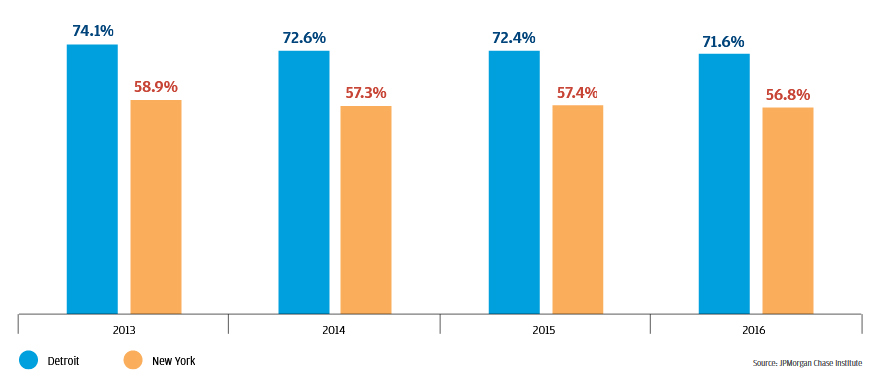
Figure 2 shows that Detroit residents made 71.6 percent of transactions outside of a 20-minute walking radius in Q2 2016. In New York, 56.8 percent of transactions occurred outside of this radius. In both cases, the proportion of transactions outside of a 20-minute radius is decreasing. Over the Q2 2013 to Q2 2016 time period, the share of transactions outside of a 20-minute radius fell by 2.5 and 2.1 percentage points for Detroit and New York, respectively. This trend is consistent with the idea that both cities are seeing some success in efforts to increase resident access to retail over time.
Figure 2: In Q2 2016, most transactions occurred outside of residents' 20-minute neighborhoods
Transactions outside 20-minute radius
The 20-minute neighborhood has served as a helpful and tractable approach for policymakers to indicate whether residents in a given neighborhood have an acceptable level of access to amenities. In fact, its tractability is the basis for the tactic’s popularity among city planners, and the reason for our exploration of the approach here. However, in a world of budget constraints, moving beyond the binary frame of whether or not residents of a neighborhood have a given level of access to retail helps local decision makers prioritize investment. Binary measures miss important details, such as how far residents actually travel to access amenities, how that distance varies based on the nature of the purchase, and how often these “distance costs” are incurred. Given that the majority of transactions occur outside of the 20-minute boundary in both cities, understanding the distribution of distances associated with those transactions is important. City investments can make the greatest impact if policymakers know which neighborhoods face the largest gaps in resident access to retail, thereby allowing for the prioritization of investment among a set of worthy options. Our approach allows us to explore differences in resident access to retail, operationalized as the aforementioned merchant distance, across neighborhoods in a way that the 20-minute neighborhood cannot.
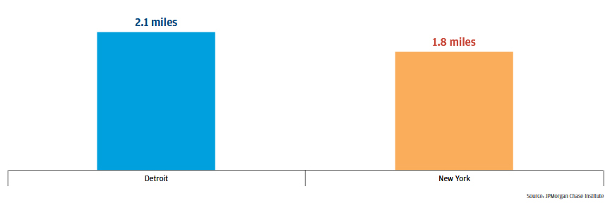
For the neighborhood-specific elements in the analysis that follows, we use the zip codes of residents as proxies for neighborhoods. Any reference to a neighborhood refers to a resident zip code. Moreover, neighborhood analysis includes only one value for each zip code, the median distance between the resident and the merchant. (Note that this is in contrast to most of the income and product type analysis in this brief, which features measurements that are not specific to individual zip codes. Rather, they capture the city-wide median distance for all transactions made by a given income group, or for a given product type.) By identifying the merchant distance for each neighborhood, we can explore how access to retail changes depending on where a resident lives within the city. In Q2 2016, residents in the typical neighborhood11 typically made purchases at merchants 2.1 miles from their home in Detroit, and 1.8 miles from their home in New York (see Figure 3).
Figure 3: In 2016, the merchant distance in a typical neighborhood was 0.3 miles longer in Detroit than in New York
Miles between resident and merchant
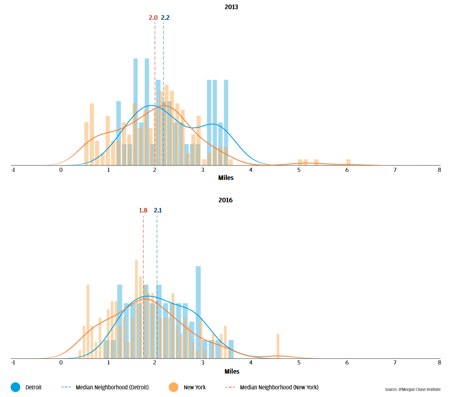
The typical merchant distance is a measure of central tendency, and therefore only tells part of the story. Figure 4 depicts the full distribution of merchant distances by neighborhood. Higher values for the bars and density plot indicate that a greater number of neighborhoods feature the associated merchant distance. This view reveals that the merchant distance in the typical New York neighborhood is shorter because the merchant distances in several neighborhoods are less than a mile. Merchant distances in nearly all Detroit neighborhoods are greater than a mile. The ability to see the full distribution also provides a more nuanced understanding of how merchant distances change over time. Between Q2 2013 and Q2 2016, the drop in Detroit merchant distances is, in large part, due to a reduction in the number of neighborhoods in which the merchant distance exceeds 3 miles.
Figure 4: Between 2013 and 2016, Detroit sharply reduced merchant distances in excess of 3 miles
Local decision makers in both Detroit and New York have a vested interest in improving resident access to retail over time. To the extent that siting new retail locations requires information about which neighborhoods are most in need, planners need some way to prioritize some neighborhoods over others. An understanding of which neighborhoods have long or short merchant distances can assist in this prioritization. In other words, planners need to understand how a given neighborhood sits in the overall distribution of neighborhoods. We can directly measure how the distribution of merchant distances across all neighborhoods is changing over time.
Figure 5: Between 2013 and 2016, the typical merchant distance fell in both cities
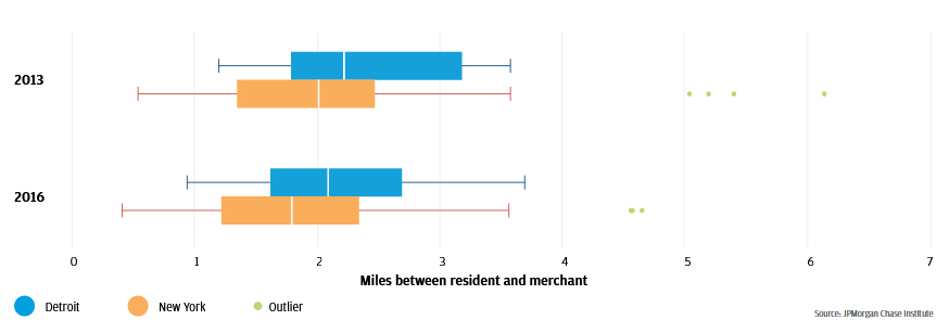
Boxplots provide a succinct way to show the median, the interquartile range (the range between the 25th and 75th percentile), and the minimum/maximum values of a distribution. For example, the median neighborhood in Detroit in Q2 2013 featured a merchant distance of 2.2 miles. This distance is captured by the line inside the top blue box in Figure 5. The neighborhoods at the 25th and 75th percentile had merchant distances of 1.8 miles and 3.2 miles, as seen at the edges of the same blue box. The “whiskers” extending from the box indicate that the shortest and longest merchant distances in the distribution were 1.2 and 3.6 miles.
Figure 5 depicts the distribution of merchant distances across all neighborhoods as boxplots12 in Q2 2013 and Q2 2016 for Detroit and New York. Over this period, the typical merchant distance in the typical neighborhood fell from 2.2 to 2.1 miles in Detroit, and from 2 to 1.8 miles in New York.13 This drop is consistent with the notion that both cities have seen gains in resident access to retail over the period.
In both Q2 2013 and Q2 2016, the range of merchant distances is wider in New York. In Q2 2016, the neighborhood with the highest level of resident access to retail in Detroit featured a merchant distance of 0.9 miles. The corresponding neighborhood in New York had a merchant distance of 0.4 miles. Residents in the neighborhood with the lowest level of resident access to retail in Detroit had a merchant distance of 3.7 miles, while New York residents in the corresponding neighborhood typically patronized merchants 4.6 miles away. Though both cities have made gains over the Q2 2013 to Q2 2016 period, residents in different neighborhoods had notably different levels of access to retail providers.
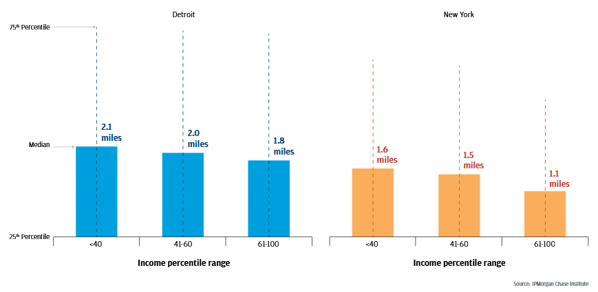
The exploration of merchant distance by neighborhood is a helpful view when thinking about which neighborhoods would experience the greatest gain from an additional retail provider. When one seeks to understand which segments of the population are most in need, however, it is useful to look at the city-wide distribution of distances within each income group or product type. To explore the experiences of residents with different levels of income, we split the population into three groups: low-, middle-, and high-income.14 In Q2 2016, typical merchant distances were longest for low-income residents and shortest for high-income residents in both cities (see Figure 615 ). In Detroit, the merchant distance for low-income residents was 15.4 percent longer than the merchant distance for high-income16 residents (0.3 miles). In New York, the difference was even larger; the merchant distance for low-income residents was 33.3 percent longer (0.5 miles). In both cities, the gap between the high- and middle-income groups was larger than the gap between the middle- and low-income groups.
Figure 6: In 2016, merchant distances were shortest for high-income residents
Miles between resident and merchant
This finding is consistent with the notion that low-income residents face gaps in access to retail. Central cities are increasingly expensive real estate markets, which limits the set of neighborhoods in which lower income residents can afford to live. Interestingly, the average (as opposed to median) distance between residents and their chosen merchants was actually longest for high-income residents, a result driven by a relatively small set of high-income residents electing to travel long distances to merchants. This phenomenon also supports the notion that high-income residents have a greater range of locational choices available to them.
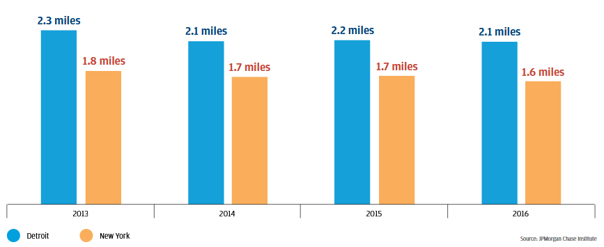
We have seen that the typical merchant distance for low-income residents was longer than the typical merchant distances for middle- and high-income residents in both Detroit and New York, but access to retail has increased for low-income residents over time. Between Q2 2013 and Q2 2016, Detroit saw a decline in the merchant distance for low-income residents, falling from 2.3 miles to 2.1 miles (-6.5 percent). Low-income residents in New York also saw gains in access to retail, with merchant distance falling from 1.8 miles to 1.6 miles over the same period (-7.8 percent).
Figure 7: Merchant distances for low-income residents in both cities fell between 2013 and 2016
Miles between resident and merchant
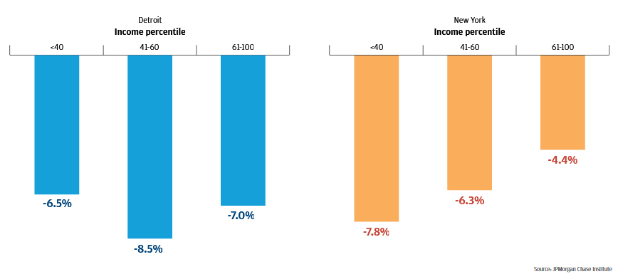
In addition to low-income residents, middle- and high-income residents of Detroit and New York saw gains in access to retail over the Q2 2013 to Q2 2016 time period, but gains in access were not evenly distributed across these groups. Between Q2 2013 and Q2 2016, low- and high-income residents in Detroit saw their merchant distances fall at similar rates (-6.5 percent and -7 percent, respectively), while middle-income residents experienced a faster rate of decline with a drop of 8.5 percent over the period. In contrast, merchant distances in New York fell fastest for low-income residents (-7.8 percent), followed by notable drops for middle- and high-income residents (-6.3 percent and -4.4 percent). Thus, access to retail in Detroit improved most rapidly for middle-income residents, while in New York it improved most rapidly for low-income residents. The extent to which one group experiences faster improvements in access to retail is driven both by where new providers are located and the kinds of products they offer.
Figure 8: Between 2013 and 2016, merchant distances in Detroit and New York fell fastest for middle- and low-income residents, respectively
Change in median distance between resident and merchant
Source: JPMorgan Chase Institute
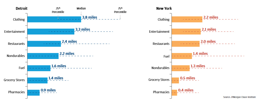
Our data show that the distances between residents and their chosen merchants vary significantly across product types.17 As shown in Figure 9, in Q2 2016 pharmacies and grocery stores were the most accessible retail outlets we observed in both Detroit and New York. The typical Detroit resident shopped at a pharmacy 0.9 miles away from their home, compared to 0.4 miles in New York. For grocery stores, the corresponding merchant distances were 1.4 miles in Detroit and 0.5 miles in New York. Merchant distances were longest for clothing, at distances of 3.8 and 2.2 miles for Detroit and New York, respectively.
Figure 9: In 2016, residents of both cities had the greatest access to pharmacies18
Miles between resident and merchant by product type
However, the ordering of product types seen in Figure 9 has not been constant. Merchant distances for each product type changed between Q2 2013 and Q2 2016; Figure 10 shows the extent of these changes over time. Detroit and New York exhibited similar trends in merchant distances to some product types but diverged in others. In both cities, merchant distances to grocery stores, nondurable providers, and pharmacies decreased over the time period, while merchant distances to entertainment venues increased. The city- specific trends diverge, however, in merchant distances to providers of clothing, fuel, and restaurants.
The typical distances between residents and merchants dropped the most for providers of necessities like pharmacies, grocery stores, and nondurable providers. The most noticeable shift between Q2 2013 and Q2 2016 occurred with pharmacies in New York; merchant distances dropped from 2 miles to 0.4 miles. The largest shift in Detroit was a decline in the merchant distance associated with nondurables, dropping from 2.5 miles to 2.2 miles.
Figure 10: Between 2013 and 2016, access to pharmacies in New York increased significantly19
Miles between resident and merchant by product type

The merchant distance for each product type varies based on the neighborhood in which a resident lives. We can get a sense for this variation by considering the merchant distance for a given product type (e.g. grocery) within a single neighborhood, and then exploring what these values look like across all neighborhoods in the city.20 Examining the full distribution of these values helps us understand whether most residents live in neighborhoods that feature merchant distances that are close to, or far from, the typical merchant distance across all neighborhoods in the city. It also allows for a better understanding of how skewed the distribution is towards higher or lower merchant distances.
Figure 11: The distributions of merchant distances tightened for most product types between 2013 and 2016
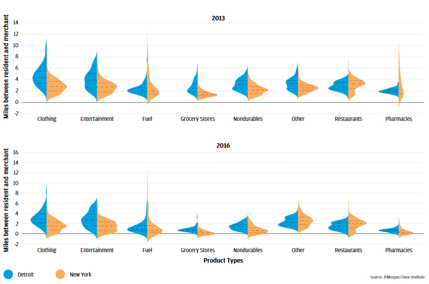
Violin plots are similar to boxplots (see Endnote 12), insofar as they provide a visual representation of the distribution of distances in our sample. However, they incorporate more information than boxplots by showing the shape of the distribution on each side of each plot element. When the violin plot is wide, it indicates that more neighborhoods feature that merchant distance. The violin plots in Figure 11 also contain lines depicting the merchant distances at the 25th, 50th, and 75th percentile of the distribution across all neighborhoods.
In the top panel of Figure 11, the blue component of the violin plot element labeled 'Clothing' captures the distribution of merchant distances by neighborhood for clothing providers in Detroit during Q2 2013. The middle dotted line captures the median (i.e. 50th percentile) value of 4.1 miles, which is the merchant distance for the typical neighborhood. The lines below and above the median capture the 25th and 75th percentile values of 3.2 and 5.4 miles, respectively. These correspond to the merchant distances in the neighborhoods at the 25th and 75th percentile of all neighborhoods, sorted by merchant distance to clothing providers.
The JPMorgan Chase Institute explored the time costs of local, commercial activity, and the data revealed that access to retail is a complex issue that can be better addressed by understanding where and how often people actually shop. We find that significant variation in the distance between residents and their chosen merchants (i.e. merchant distance) exists across product types, and the merchant distance tends to be shorter for high-income residents. In general, resident access to retail in both cities is on the rise, with the number of transactions that occur within a 20-minute radius increasing over time. Despite different starting conditions, residents of both Detroit and New York have seen gains in access to retail.
Our analysis has revealed that the concept of a 20-minute neighborhood is a useful tool that can convey real information about access to retail within a city. However, the view it provides has blind spots that may lead to problematic allocations of investment resources. Moving from a binary frame to one that approaches an estimate of the actual distance travelled reveals important facts about resident behavior that can help local decision makers prioritize future investment.
In both Detroit and New York, residents in our sample allocated over 38 percent of card spending to restaurants in Q2 2016. In Detroit, the next closest product type was clothing, at 27.9 percent (compared to 38.2 percent for restaurants). Moreover, restaurants have comprised a growing share of card spend over time. Most of this growth has come since early 2014. The fuel spending share, by contrast, has declined over this period.
Figure 12: Proportion of transactions by product type
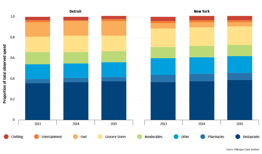
In New York, the gap was even larger. Restaurants captured 38.6 percent of spend, while grocery stores captured 17.9 percent. Like Detroit, the share of card spend allocated to restaurants increased, while fuel spending saw somewhat of a decrease. Entertainment spending represented a small fraction of total spend observed, at 1.6 percent in Detroit and 1.9 percent in New York.
The JPMorgan Chase Institute conducted the analyses in this brief using de-identified data on credit and debit card transactions of residents in the Detroit and New York metropolitan areas. The sample period is restricted to the second quarter of each year in the 2013 to 2016 period. We chose quarterly observations to avoid the volatility we observed in monthly observations, and the second quarter of 2016 was the most recent quarter for which we had complete data at the time of the analysis. The sample population is restricted to residents of the central city inside each metropolitan area, but the merchants they frequent may be anywhere inside said metropolitan area. The final sample captures over 197 million transactions from more than 1 million residents in the 12 months we included.
Each transaction record in the data carries the zip codes of both the resident and the merchant as attributes. The resident's zip code captures the location of their home, as opposed to their place of work. The distance associated with a single transaction is the distance in miles between the centroid of the resident’s zip code and the centroid of the merchant’s zip code.
The distances reported as “typical” represent the median distance in a given distribution. Typical “merchant distances” represent the median distance between residents and the merchants they have chosen to patronize. To identify this value, we first sort distances in the relevant intersection (e.g. all transactions in Detroit in Q2 2016). Within this intersection, we count the total number of transactions for each resident-merchant zip code pairing. We also calculate the cumulative transaction total across these zip code pairings and the total number of transactions within the intersection. The percentile value associated with each distance is calculated as the ratio of the cumulative sum to the total sum of all transactions in the intersection. Once percentile values are associated with each distance in the intersection, we identify the median as the first distance that has a percentile value over 50. Other quartiles are identified in a similar fashion.
The median distance per transaction (or merchant distance) is a useful metric that adds more information than a hard boundary at a fixed distance from a given point. The boundary can tell us whether or not a merchant is within a 20-minute walk, but it provides no information about how far inside or outside of the boundary said merchant resides. However, our implementation of the approach does have limitations.
1. Centroid-to-centroid distance is used instead of address-to-address distance because latitude and longitude information is removed for privacy reasons before the data reach the Institute. If the resident and merchant reside close to the centroid of their respective zip codes, the measurement error associated with a centroid-to-centroid measurement will be small. If the resident and merchant reside close to the borders of their respective zip codes, material errors in distance measurement can arise. The potential size of these errors grows with the size of the zip code. The risk of this type of measurement error is larger in Detroit, which features an average zip code size of 18.9 square miles, than it is in New York, which features an average zip code size of 9.7 square miles. However, we have no a priori rationale supporting the belief that the distribution of residents and merchants is systemically biased towards or away from the centroid in each zip code. If we assume that residents and merchants are randomly distributed within the zip code, said assumption implies that our distance measurements across the entire sample are unbiased (even if individual measurements contain error). The 20-minute neighborhood approach avoids this particular type of measurement error altogether by not attempting to provide the information contained in a continuous measure of distance.
2. Merchants may be spatially arranged in a way that promotes “trip chaining”, which is the practice of patronizing multiple stores in a single trip. Since we treat each transaction equally, we do not account for short trips between merchants, within a single shopping excursion. Again, the 20-minute neighborhood approach avoids this particular type of measurement error by not attempting to provide the information contained in a continuous measure of distance. In general, transactions and their associated weights do not come into play.
3. Our measurement frame is focused on the relationship between the resident’s home and the merchant’s location. Even if residents do not live near merchants they wish to patronize, they may work close to them. Since we do not observe where residents work, it is possible we may overstate the marginal effort residents must expend to reach merchants. In this case, the 20-minute approach suffers from the same vulnerability. It is less important to have a grocery store in your neighborhood if one is easily accessible from your place of employment.
The limitations of the median “centroid-to-centroid distance” approach are far outweighed by the information contained in a continuous measure of the potential distance residents must travel, insofar as it offers at least a rough bucketing of distance that can be used for triage. Stark and persistent differences across zip codes and segments of the population are clear enough signals for action.
For our purposes, “local decision makers” refers to local government officials (e.g. Mayors and city planners), local business owners, and researchers/advocacy groups devoted to local economic issues
The 20-minute neighborhood concept is further explained and compared to our chosen metric in Finding #1.
The median is a measure of central tendency in a distribution. It is an alternate name for the 50th percentile. If we had 100 distances and sorted them in ascending order, the median would be the 50th distance. Said differently, the median is the point in the distribution at which (approximately) half of the distances are shorter and half of the distances are longer. This analysis will also make use of the 1st and 3rd quartiles, which occur at the 25th and 75th percentile, respectively. In the context of our sorted set of 100 distances, the 25th percentile would be the 25th distance. One-quarter of distances in the distribution would be shorter, while threequarters would be longer. A similar construction is used for the 75th percentile.
The choice of quarterly measures allows us to avoid the volatility of monthly measures while also providing a more recent view of distances than would be possible with an annual measure.
Since the 20-minute neighborhood approach does not attempt to measure distance travelled, it cannot differentiate between transactions beyond roughly one mile. If the closest grocery store is 1.1 miles away, the demand for a new provider is less than it would be if the closest grocery store was 10 miles away. This is a material blind spot in the 20-minute approach.
For our purposes, the “typical” distance is found at the median of the distribution. The distance measurement and associated implications are addressed in the Methodology section.
These are city-wide medians that consolidate transactions across all zip codes, product types, and income groups. There is variation in trip length across all three of these dimensions. In both cities, distances of zero represent shopping that occurs within one’s own zip code, and they represent the lower bound. The longest trips are 43.5 miles in the Detroit metropolitan area, and 78 miles in the New York metropolitan area.
The colors in each zip code represent the typical distance per transaction between a resident’s home and the merchant’s location.
Typically, the set of amenities defined by cities also includes parks, schools, and other non-retail amenities. Portland's sophisticated implementation of this approach also includes additional information about barriers to walking like steep grades, rivers, and freeways, as well as enabling infrastructure like sidewalks and transit nodes. In the Portland Plan, the units of analysis are referred to as “Vibrant Neighborhood Centers” (https://www.portland.gov/bps/planning/documents/portland-plan/download).
For our purposes, we consider a transaction to be from a provider inside the 20-minute radius if the merchant distance associated with said transaction is less than the distance an average person would walk in 20 minutes. We assume an average walking speed of 3.1 miles per hour, which corresponds to a 20-minute radius that is a little more than one mile. The distance we use for this calculation is the distance between the centroid of the resident’s zip code and the centroid of the merchant’s zip code.
The “typical neighborhood” refers to the median zip code. It is identified by establishing the median distance travelled in each zip code, sorting all zip codes by their respective median distances, and then identifying the zip code at the 50th percentile in this distribution. The median, unlike the mean, is not influenced by extreme distances at either end. We chose it because the longest distances occurred rarely and were quite a bit further than most of the distances in the distribution, which limited the representativeness of the mean as a measure that captures the typical resident’s experience.
The components in each boxplot capture important values in the distribution. Within the main box, the middle line represents the median value, which we characterize here as the “typical” representative value in a given distribution. The left and right edges of the box represent the 25th and 75th percentile values. In other words, 25 percent of transactions are associated with distances that are shorter than the distance value at the left edge of the box. Likewise, 25 percent of transactions are associated with distances that are longer than the value at the right edge. The whiskers extend to the minimum and maximum data points that are less than or equal to 1.5 times the interquartile range (the distance between the 25th and 75th percentile). All data points in excess of 1.5 times the interquartile range are classified as outliers and shown individually.
These changes correspond to a median distance drop of 6.2 percent in Detroit and 11.9 percent in New York for the median zip code. Note that this is the value for the median distance in the median zip code. If one stops measuring at the zip code level and just focuses on the median trip distance for the entire city, the drops are much more equitable. Between Q2 2013 and Q2 2016, Detroit drops 5.7 percent, and New York drops 5.8 percent.
For our purposes, low-income residents are those that sit in the lower 40 percent of the income distribution. Middleincome residents sit between the 41st and 60th percentile, while high-income residents sit above the 60th percentile. We group the 1st and 2nd quintiles, as well as the 4th and 5th, to accord with privacy standards.
Figure 6 depicts merchant distances for each income group in the main bar of each plot element. The dotted line that overlays each bar captures the interquartile range of distances. The bottom of the line is the distance at the 25th percentile of all transactions in the income group in question. When the distance associated with a given transaction is zero, it means that the transaction occurred within the resident’s zip code. Consequently, when the dotted line touches zero, it means that 25 percent or more of all transactions across all zip codes occurred within the residents’ zip code. The top of the line captures the distance at the 75th percentile of all transactions for the income group. Note that outliers are not considered in these plots.
All percentage change figures over the 2013 to 2016 period in this brief are calculated using numbers with a higher degree of precision than those displayed in the brief.
For this calculation, we looked at the city-wide universe of transactions within each product type, not just the merchant distance within each neighborhood. In this way, it mirrors the income group analysis in earlier findings.
Much like Figure 6, Figure 9 figure depicts the median distances between residents and chosen merchants as the main bar element, and the interquartile range (the range between the 25th and 75th percentile of all distances for a given product type) as an overlaid dotted line.
Positive values in this chart indicate that the merchant distance was higher in 2016, which corresponds to a decline in resident access to providers of a given product type. Residents of Detroit only saw a reduction in access to entertainment providers over the depicted period. Residents of New York saw reductions in access to restaurants in addition to providers of clothing and entertainment.
Note that this neighborhood view differs from the productspecific, yet city-wide view of the first part of Finding 5. It returns to the “merchant distance by neighborhood” frame of Findings 1 & 2.
Authors

Diana Farrell
Founding and Former President & CEO

Lindsay Relihan
JPMorgan Chase Institute Academic Fellow

Marvin Ward
Local Commerce Research Lead JPMorgan Chase Institute